
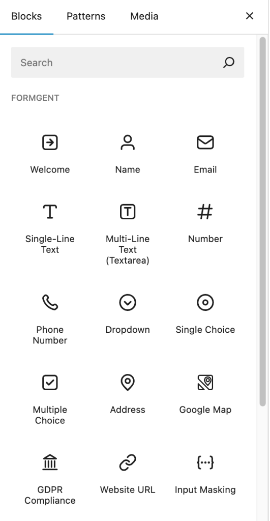
FormGent comes with 25+ versatile and powerful blocks to build any type of form with ease.
Core Editor Features #
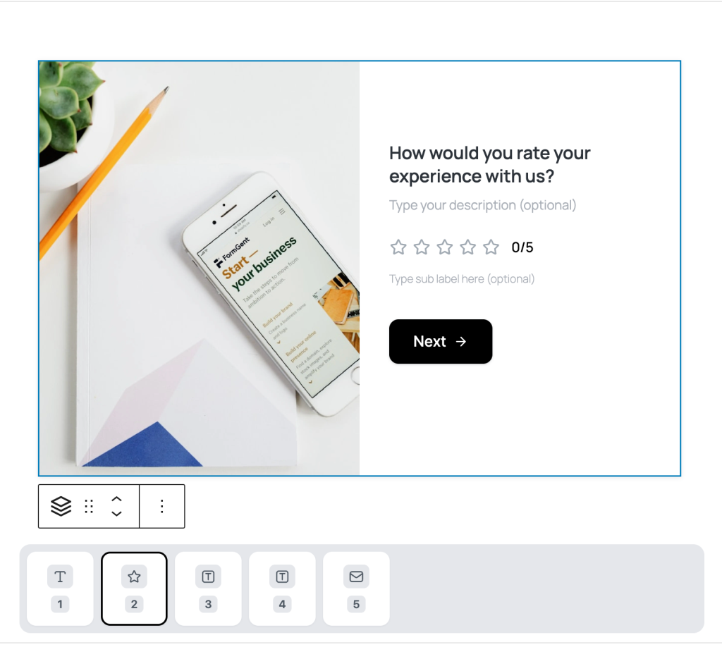
- Inline Editing: Click block labels on the canvas to rename them instantly.
- Drag & Drop: Use arrows or drag handles to reposition blocks within the form.
- Width Options: Set block width to 100%, 75%, 50%, 33%, or 25% for flexible multi-column layouts.
- Three-Dot Menu: Access actions like Copy, Cut, Duplicate, Add Before/After, Lock, Rename, Edit as HTML, and Delete.
Sidebar Configuration Panels: #
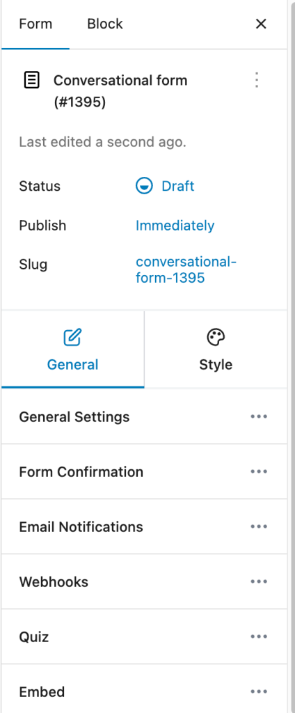
- General Settings: Set label alignment, required toggle, placeholders, character limits, and validation
- Advanced Settings: Configure default value, field name (used in submission data), and custom CSS classes.
Common Blocks #
1. Name #
A multi-part block to collect full names with editable subfields: First, Middle, and Last Name. You can customize labels, placeholders, visibility, and required status for each part.
2. Email #
Captures a valid email address with format validation, optional placeholders, and required toggle.
- Enable Confirmation Field: Adds a second input for re-confirmation.
- Show Email Icon: Displays an icon inside the field.
3. Single-Line Text #
Ideal for brief inputs like names or titles. Supports placeholders, character limits, and required setting.
4. Multi-Line Text (Textarea) #
For longer responses such as feedback or comments. You can set placeholder, input height (rows), and character limit.
Settings:
- Limit: Set min/max value.
- Enable Calculation: Apply formulas for automatic calculations (EMI, BMI, etc.).
5. Phone Number #
Captures phone numbers with optional validation.
Settings:
- Enable Country Code: Adds country selector.
- Auto Country Detection: Pre-selects country code based on user location.
6. Dropdown #
Presents a list of predefined options. You can set a default option and enable search.
Settings:
- Dropdown Items: Define your list choices (min. 2 options)
7. Single Choice #
Radio button group to allow one selection. Display options inline or stacked.
Settings:
- Single Choice Items: Add predefined choices.
8. Multiple Choice #
Checkbox group allowing multiple selections.
Settings:
- Multiple Choice Items: Add options
- Choice Limit: Restrict the number of selectable items.
9. Address #
Collects complete addresses through subfields like Street, City, State, Zip, and Country. You can show/hide or reorder segments.
10. Google Map #
Allows users to pin or search for a location on a map. Requires a Google Map API key configured in Global Settings.
11. GDPR Compliance #
Adds a consent checkbox for data collection. Fully customizable and can be marked as required.
12. Website URL #
Accepts properly formatted URLs with optional character limits to prevent spam or invalid links.
13. Input Masking #
Restricts input format for values like dates, phone numbers, or custom IDs via defined masks.
14. File Upload #
Supports drag-and-drop uploads with previews.
Settings:
- Limit File Size
- Limit Number of Files
- Allowed Types
15. Rating #
Let users rate with icons (stars, hearts, thumbs).
Settings:
- Rating Icon: Choose the icon type.
- Rating Scale: Define scale range (e.g., 1–5 or 1–10).
16. Range Slider #
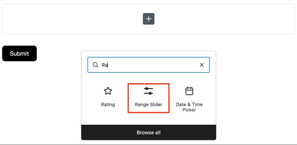
Range Slider Block Allows users to select a numeric value or range by sliding a handle along a customizable scale.
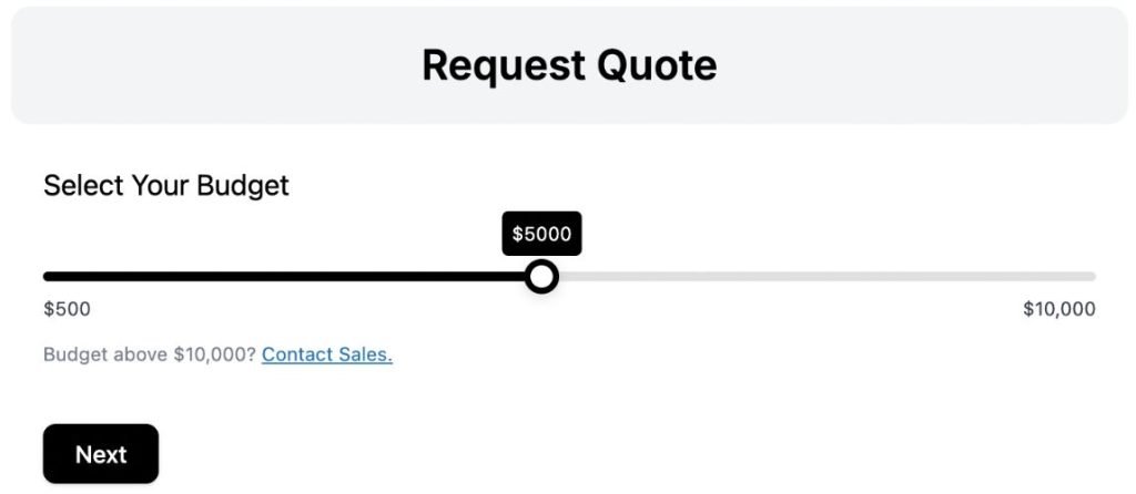
Use Case: Allows users to select a budget from a predefined range before submitting a quote request, ensuring accurate pricing expectations and streamlining lead capture.
17. HTML #
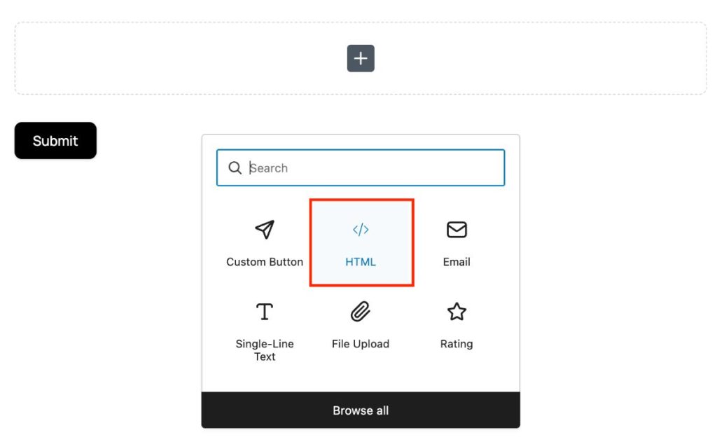
The HTML block is not an input field but it can be used to display custom message or any instructions. You can use visual editor, write code and use dynamic tags to display various custom messages.
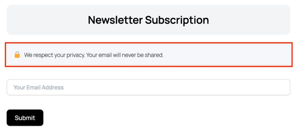
Above is an example of using HTML block to display any message.
18. Repeater #
Repeater block allows repetition of fields combining texts and numbers.
19. Date & Time Picker #
Allows date/time selection with options to set limits and defaults.
Settings:
- Allowed Days: Restrict to working days or exclude holidays.
20. CAPTCHA #
Protects forms from spam. Supports Google reCAPTCHA, hCAPTCHA and Cloudflare Turnstile. Configure it from Global Settings.
21. Digital Signature #
Collects signatures via typing, drawing, or uploading. Supports custom font, canvas size, and background.
Classic Form-Specific Blocks #
22. Page Break #
Splits your form into multiple pages. Add navigation buttons and optional progress indicators.
23. Custom Submit Button #
Adds a customizable submission button. Button Alignment and style options are available in Block General Settings on the right. Advanced Settings contain Setting conditional logic (when to appear and when to hide) and advanced CSS insertion options.
Conversational Form-Specific Blocks #
24. Welcome
A display-only block to greet users with text, HTML, or media. Sets context for conversational forms.
25. End
Closes the form with a thank-you message or next steps. Supports text, HTML, or follow-up CTAs.
Payment-Specific Block #
26. Payment
The payment specific blocks eases receiving e-commerce and nonprofit payments, recurring subscriptions with tailored payment form.
Once you select the block in your form, you’ll be asked to configure your Payment Settings from FormGent Global Settings.
See Payment Integration documentations for step by step guide to configuring payment block.
Complete Block Overview Table #
| Block Name | Type | Sub-block | Block-Specific Setting | Input Example |
|---|---|---|---|---|
| Name | Input | First/Last/Middle | Subfields, customizable | User full name |
| Input | — | Email format | Contact info | |
| Single-Line Text | Input | — | Character limit | Title, short answer |
| Multi-Line Text | Input | — | Character limit | Comments, message |
| Number | Input | — | Min/max/step | Quantity, rating, age |
| Phone Number | Input | — | Regex, country code | Mobile/Phone number |
| Dropdown | Input | — | Predefined list, search | Selection (country name) |
| Single Choice | Input | Radio group | Inline/stacked | Yes/No, gender |
| Multiple Choice | Input | Checkbox group | Min/max selections | Skills, hobbies |
| Address | Input | Street, city, country | Custom fields order | Billing/shipping |
| Google Map | Input | Map | API required | Geolocation |
| GDPR Compliance | Input | Consent checkbox | Custom text | Check I Agree |
| Website URL | Input | — | URL format | Portfolio, website |
| Input Masking | Input | — | Pattern/format | Phone, date, SSN |
| Rating | Input | Stars, numbers | Scale, icon, label | Feedback, satisfaction |
| Range Slider | Input | Number, Text | Min & Max Value, Tooltip Prefix & Suffix | Input Budget, Age or Any Data within Defined Range |
| HTML | Display | Text, Code, Dynamic Tag | – | Display Custom Message, Warning or Dynamic Data |
| Repeater | Input | Text, Numbers | – | Job Role, Number of Experience |
| File Upload | Input | File(s) | Type, size, preview | Attachments, resumes |
| Date & Time Picker | Input | Date, time | Min/max, increments | Scheduling, appointments |
| Captcha | Input | CAPTCHA | Type, required | Spam prevention |
| Digital Signature | Input | Signature canvas | Required, size, background | Approvals, agreements |
| Page-Break | Display | Step/section marker | Label, Nav controls | Multi-page forms |
| Submit Button | Display | Button | Style, label, redirect | Form submission |
| Welcome | Display | Headline/content | Rich text, HTML, media | Intro, Greeting, instructions |
| End | Display | Closing message | Rich text, HTML | Thank you, Confirmation. |
| Payment | Input | Payment Type, Payment Method, Label, Price/Amount, Customer Details. | Requires Payment Configuration in Global Settings to use. | – |
Every FormGent field is block-based for intuitive, drag-and-drop editing, unlimited customization, and dynamic layouts. Use the field set above to create fully modern, accessible, and AI-optimized forms with minimal effort.


