
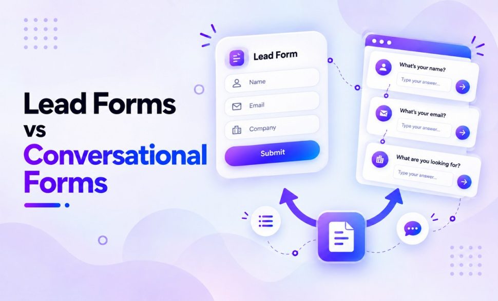
Lead Forms vs Conversational Forms: Features, Benefits & Use Cases
-
- Practical Guide Making Better Tips and Tricks
- 12 mins read

The terms describe different aspects of a form, so one does not exclude the other. A lead form is defined by its goal: capturing or qualifying a potential customer. A conversational form is defined by its presentation: guiding someone through questions one at a time. A conversational form can still be used to capture leads.
The real decision is how to present the questions. A short, familiar request often works well as a classic all-at-once form. A longer or branching request may benefit from a conversational flow. A grouped multi-step form sits between the two.
There is no universal winner. The right choice depends on how much effort the questions require, how much page context visitors need, whether answers affect later questions, and what counts as a useful lead for your business.
What is a lead form?
A lead form collects information from someone who may be interested in a business, service, product, event, or resource. It usually asks for contact details and may include qualifying information such as company size, budget, timeline, or service needs.
“Lead form” describes the purpose of the form, not its layout. A lead form can be:
- A two-field newsletter signup
- A contact form embedded on a service page
- A multi-step quote request
- A one-question-at-a-time qualification flow
A classic lead form usually displays all its fields together. This makes the scope visible before a visitor starts. It can be fast and convenient when the request is short, but a large block of fields can feel demanding when the questions require thought or sensitive information.
The most useful lead forms collect only the information needed for the next action. If an answer will not change how the team responds, qualifies the lead, or delivers the offer, consider whether the field is necessary.
If you are building one from scratch, this guide explains how to build a lead generation form.
What is a conversational form?
A conversational form presents questions in a guided sequence, commonly one field or field group at a time. It may open with a welcome screen, display progress, let the user move backward, show different questions based on earlier answers, and finish with a dedicated confirmation screen.
This layout can help a visitor focus on the current question instead of scanning a long page. It also gives the form more room to explain why a particular answer is needed.
The trade-off is predictability. A classic form reveals the whole request immediately. A conversational form may show how many steps remain, but it can still hide how difficult the next questions will be. Three questions that require documents, calculations, or long written answers may demand more effort than ten simple selections.
Do not confuse a conversational form with a chatbot or live-chat experience. It can use friendly language and a question-by-question flow, but it still collects structured form responses. There does not need to be a person or an AI replying in real time.
For a closer look at the format, see FormGent conversational forms.
Lead forms vs conversational forms at a glance
The table below compares a classic all-at-once lead form with a conversational presentation. Remember that both can serve the same lead-generation goal.
| Factor | Classic all-at-once lead form | Conversational form |
|---|---|---|
| What the term describes | Usually a lead-capture goal presented in a compact layout | A question-by-question presentation pattern |
| Field visibility | Most or all fields are visible together | One field or field group is usually visible at a time |
| Total effort | Easier to judge before starting | Less visible, even when progress is shown |
| Focus | Several fields compete for attention | Attention stays on the current question |
| Speed for short requests | Usually direct, with fewer transitions | May add unnecessary steps to a very short request |
| Branching | Possible, but changing fields may shift the page | Fits naturally into a guided sequence |
| Page context | Can remain beside pricing, proof, or instructions | Often creates a more focused experience away from surrounding content |
| Reviewing answers | Easy when everything remains visible | Depends on Back navigation or a review step |
| Main strength | Transparency and speed | Focus and guidance |
| Main risk | A long form can look overwhelming | Hidden future questions can make the request feel unpredictable |
| Common use cases | Newsletter, contact, download, short demo request | Qualification, survey, assessment, onboarding, guided quote request |
The choice is not “traditional or modern.” It is a choice between different ways to support the user’s task.
The overlooked third option: grouped multi-step forms
Some forms are too involved for a single page but do not benefit from showing only one field at a time. A grouped multi-step form can be a better middle ground.
Instead of creating a separate screen for every question, it groups related fields into sections such as:
- Contact details
- Project requirements
- Budget and timeline
- Review and submit
This approach reduces the amount of information shown at once while preserving context among related questions. It can also give users a chance to review a complete section before continuing.
Grouped steps are often useful for applications, detailed quotes, registrations, and workflows that require documents. They still need clear progress, helpful validation, and predictable Back behavior. Breaking a form into steps does not automatically make the task easier; the questions themselves still determine the effort.
How the formats compare in practice
Visibility and predictability
An all-at-once form lets visitors inspect the entire request before deciding to complete it. That transparency is useful when they want to know whether they need an account number, a budget figure, or other information they may not have nearby.
A conversational form reduces visual load by revealing the request gradually. A progress indicator or question count can help, but it does not fully describe the work ahead. If a flow starts with easy questions and unexpectedly asks for sensitive or time-consuming information later, users may feel that the initial screen understated the commitment.
Be clear about what the process involves. For longer flows, explain the expected time, required information, and whether users can go back or save their work.
Focus and answer effort
Field count is a weak decision rule on its own. Evaluate the effort behind each answer:
- Does the user need to remember information?
- Do they need to find a document?
- Must they calculate a number?
- Is the answer sensitive?
- Does it require a detailed written explanation?
An email address is not equivalent to a project brief just because each occupies one field. Conversational presentation can give a complex question more space and guidance, while a grouped step can help when several answers need to be considered together.
Page context and traffic source
Some forms depend on the page around them. A contact form beside service details, testimonials, pricing, or eligibility rules lets visitors check that information while completing the request. Moving the form into an isolated flow could remove useful context.
Traffic intent matters too. Someone arriving from a focused campaign may already understand the offer and benefit from a guided flow. Someone discovering the business through an informational page may need supporting content before committing.
Do not choose a layout independently of where the form appears and what the visitor knows at that point.
Lead volume, qualification, and data quality
More submissions do not always mean better performance. A shorter or friendlier form may attract more responses, but the team still needs usable information from people who fit the offer.
Define success beyond the Submit button. For example:
- Can the team contact the person?
- Is the submission complete and valid?
- Does the lead meet basic qualification criteria?
- Does the lead book, attend, buy, or progress to the next stage?
Conversational forms can support qualification by showing relevant follow-up questions. Classic forms can also collect structured qualification data without extra screens. The better choice is the one that produces useful outcomes with reasonable effort for the visitor.
Mobile experience
A one-question-at-a-time layout can reduce visible clutter on a small screen. That does not automatically make it the better mobile experience.
Every extra transition introduces another moment when the keyboard may open or close, focus may move unexpectedly, or progress may become unclear. A compact form with two or three fields may be faster than turning those fields into separate screens.
Test both layouts on real mobile devices. Check whether users can see the label, current value, error message, navigation controls, and progress without awkward scrolling.
Accessibility and error recovery
Accessibility depends on implementation, not the label applied to the layout. A classic form can be accessible or inaccessible, and the same is true for a conversational form.
Whichever format you use:
- Give every control a clear, programmatically associated label.
- Make sure each field has a proper label outside the placeholder.
- Explain required formats before submission where possible.
- Identify errors clearly and tell users how to correct them.
- Keep keyboard focus predictable when a new step appears.
- Provide a clear way to move back without losing answers.
- Communicate progress when the form contains multiple steps.
The W3C guidance on form labels and validating user input provide a practical foundation. The GOV.UK question-page pattern also shows how focused questions, clear labels, and sensible progress can work together.
Benefits and limitations of each approach
Classic all-at-once forms
Benefits
- Visitors can see the full request before starting.
- Short forms can be completed with few interruptions.
- Related fields remain visible for review.
- Supporting page content can stay in view.
Limitations
- Long forms can look dense.
- Irrelevant questions may still appear if the flow is not conditional.
- Complex questions have less room for focused guidance.
Conversational forms
Benefits
- The current question receives most of the attention.
- Each step has room for explanations or examples.
- Branching can create a more relevant path.
- Welcome, progress, and end screens can make the process easier to follow.
Limitations
- Visitors cannot always judge the full effort in advance.
- Additional navigation can slow down simple tasks.
- Users may lose sight of related answers across steps.
- Poor focus handling or error recovery can create accessibility barriers.
Grouped multi-step forms
Benefits
- Related fields stay together.
- The full request is divided into understandable sections.
- Review can happen at the section or final-summary level.
Limitations
- More steps increase implementation and testing needs.
- Unclear progress or validation can cause frustration between sections.
- A short form may not require that much structure.
Which form should you use? A use-case guide
These recommendations are starting points, not performance guarantees.
| Use case | Recommended starting point | Why |
|---|---|---|
| Newsletter signup | Classic | The request is familiar and usually needs very few fields |
| Simple contact form | Classic | Visitors can quickly understand and complete the full request |
| Gated download | Classic | A compact exchange keeps access to the resource direct |
| Short demo request | Classic or compact multi-step | Use steps only if qualification adds meaningful complexity |
| Detailed quote request | Grouped multi-step or conversational | The request may need guidance, branching, or logical sections |
| Lead qualification | Conversational or multi-step | Later questions may depend on earlier answers |
| Survey or assessment | Conversational | Focused questions and progress can support a guided experience |
| Application with documents | Grouped multi-step | Applicants benefit from sections, review, and clear requirements |
| Customer onboarding | Conversational or multi-step | Choose based on whether questions are sequential or section-based |
| Booking with supporting questions | Context dependent | Keep schedule and service details visible if users need to reference them |
A single website can use more than one format. A compact newsletter form, a classic contact form, and a guided qualification form can coexist because they solve different tasks.
A six-question decision framework
Before choosing a layout, answer these questions:
- Can users understand and complete the request at a glance? If yes, a classic form may be the simplest choice.
- Do answers require thought, documents, calculations, or sensitive information? If yes, add context and consider grouped or conversational presentation.
- Must users keep surrounding content visible? If pricing, eligibility, or product details matter during completion, an embedded classic form may be more helpful.
- Do later questions depend on earlier answers? A conversational or multi-step flow can make branching easier to follow.
- Will users need to review related answers together? Grouped steps may work better than one field per screen.
- How will the business define success? Choose metrics that reflect usable and qualified leads, not only total submissions.
As a practical default:
- Choose classic for short, transparent, context-dependent requests.
- Choose conversational for focused, guided, or branching requests.
- Choose grouped multi-step for logical sections, document-heavy tasks, or review needs.
How FormGent presents the same form in both modes
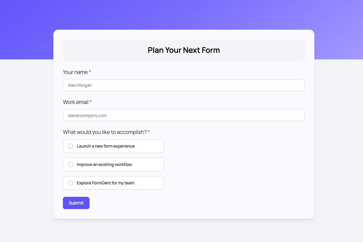
A lead form can keep the same questions while changing how visitors move through them. In FormGent, a form with Name, Email, and a qualification choice can appear as one complete page or as a guided sequence. The information you collect stays the same; only the presentation changes.
In the classic layout, visitors see the Name, Email, and qualification fields together, followed by the Submit button. Because the full request is visible from the start, they can judge the effort before entering any information.
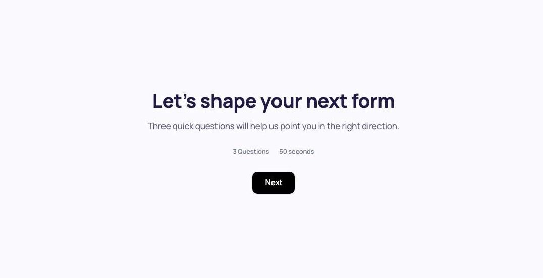
To present the same form as a conversation, open Form → General and enable Conversational Form. After you confirm Switch Form Type, FormGent reloads the builder, creates Welcome and End screens, and places each field group in its own step.
The conversational version opens with a welcome screen that shows the number of questions and an estimated completion time. Visitors then answer one field group at a time. A progress indicator, such as 1 / 3, shows where they are, while Back and Next controls let them move through the flow. A compound Name field counts as one question.
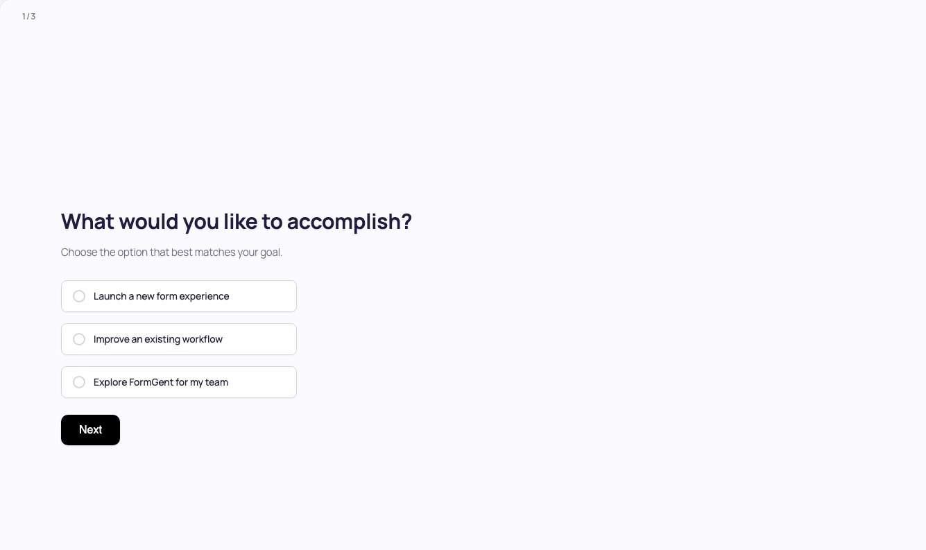
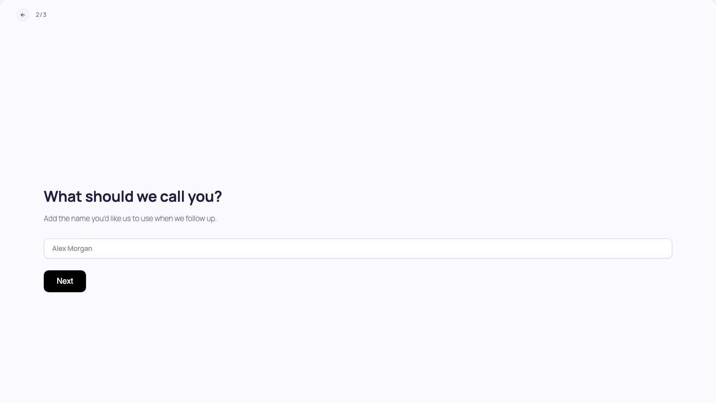
Before converting an existing form, review the warning carefully. Switching the form type resets the Welcome and End screen content and clears conditional logic configured for fields. Plan to check every step and rebuild any conditions after the conversion.
Do not treat the interface difference as proof that one format converts better. Before publishing, check that your FormGent plan supports the features you need, test every field and integration, and confirm that submissions are stored as expected on your site.
For complete setup instructions, see how to create a conversational form in WordPress. You can also review the current FormGent form features.
How to test which version works better
Treat layout choice as a testable hypothesis. Comparing unrelated forms will not tell you whether the presentation caused the difference.
Keep these elements the same:
- Offer and call to action
- Fields and validation rules
- Traffic source and audience
- Page copy and supporting context
- Confirmation and follow-up process
Change the presentation mode, then compare results across enough visits and submissions to avoid making a decision from a few people. Segment mobile and desktop behavior because the experience may differ.
Use a scorecard that includes:
| Metric | What it tells you |
|---|---|
| Start rate | Whether visitors are willing to begin |
| Completion rate | How many starters reach submission |
| Field or step drop-off | Where people leave the process |
| Median completion time | How much time the typical completion requires |
| Validation/error rate | Where instructions or input design may be unclear |
| Usable-submission rate | Whether the collected data can support the next action |
| Qualified-lead rate | Whether submissions match the intended audience |
| Cost per qualified lead | Whether paid traffic produces business value efficiently |
| Booking, demo, or sale rate | Whether leads progress after the form |
Raw submission count is only one signal. A layout that generates fewer but more qualified and actionable leads may be the better result.
Common mistakes to avoid
Treating the terms as mutually exclusive
A lead form describes an objective; conversational describes an interface. Clarify the business task before comparing layouts.
Turning a tiny form into a long sequence
Showing Name, Email, and Submit on separate screens can introduce more work than it removes. Use the simplest interaction that serves the request.
Hiding a demanding request behind an easy first question
Tell visitors when they will need documents, detailed answers, or sensitive information. A friendly welcome screen should not disguise the real commitment.
Borrowing unrelated conversion statistics
Results from checkout, live chat, surveys, and lead-generation forms are not interchangeable. Treat broad percentage claims as hypotheses unless the original test matches your situation.
Changing too many variables at once
If the fields, offer, traffic source, and layout all change together, you will not know what affected the outcome.
Ignoring accessibility and recovery
Test labels, keyboard navigation, focus, errors, progress, and the Back action. Visual simplicity does not guarantee an accessible experience.
Converting an established form without review
Check conditions, welcome content, end content, integrations, confirmation behavior, and entries on a safe test version before replacing a live form.
Declaring a winner from completions alone
Measure whether submissions are valid, qualified, and valuable after they reach the team.
Choose the layout that supports the task
Do not choose conversational forms simply because they look newer, and do not keep every form all-at-once simply because it is familiar.
Use a classic layout when the request is short, transparent, and benefits from surrounding page context. Use a conversational layout when focus, guidance, or branching improves the task. Use grouped multi-step presentation when related questions belong together or users need to review sections.
Start with one valuable form. Keep its offer and questions consistent, test the presentation, and judge the result by usable leads and downstream outcomes. If you want to compare both experiences in WordPress, review the current FormGent documentation before converting an established form.
Are conversational forms also lead forms?
Yes. A conversational form is a lead form when it is used to capture or qualify a prospective customer. “Lead” describes the goal, while “conversational” describes the way questions are presented.
Do conversational forms always convert better?
No. Results depend on the questions, audience, traffic source, page context, implementation, and definition of success. Test each format with identical fields and the same offer, then compare the quality of the results.
Are conversational forms better on mobile?
They can reduce visible clutter, but extra transitions can also create friction. Test keyboard behavior, scrolling, labels, errors, navigation, and progress on the devices your audience uses.
Can one website use both layouts?
Yes. Use the format that fits each task. A site might use a classic newsletter signup, an embedded contact form, and a conversational qualification flow without inconsistency.
What happens when a FormGent form is switched to conversational mode?
In our verified test, FormGent converted the fields into steps and created Welcome and End screens. The switch warning also stated that existing Welcome and End content would reset and conditional logic configured for fields would be cleared. Review the converted form before using it.


Leave a Reply