

Types of Forms: The Only Guide You Need to Pick & Build the Right One
-
- Form Builder AI-Form Builder
- 40 mins read
Long ago, people depended entirely on paper forms to collect information. Whether it was gathering leads, processing applications, or recording data — paper was the only option. And honestly? It was limiting. You couldn’t customize much. Collecting responses was slow. And managing all that paperwork was a headache.
Fast forward to today, and paper forms are nearly a thing of the past. Online forms have taken over and for good reason. They’re faster, smarter, and far easier to manage. The best part? The types of forms you can create online are almost limitless.
That said, some forms are more popular than others. Certain types are used by millions of individuals and businesses every single day from collecting leads to processing job applications to gathering customer feedback.
In this blog, we’ve listed 25+ types of forms that help individuals and businesses meet their different goals. Whether you want to grow your email list, accept job applications, collect payments, or run a survey — there’s a form built exactly for that purpose.
And by the end of this guide, you’ll not only know the different types of forms — you’ll also learn an easy way to create them without touching a single line of code.
So without further ado, let’s get into it.
Why Businesses and Individuals Need Different Types of Forms
Think about it this way.
A doctor needs to know your medical history before treating you. A company needs your details before hiring you. An online store needs your shipping address before sending your order. Every situation requires different information and that’s exactly why different types of forms exist.
There’s no one-size-fits-all form. What works for a hospital won’t work for a marketing agency. What a school needs from a student is completely different from what a bank needs from a customer. Each form is built around a specific goal.
For businesses, forms are one of the most important tools they have. Here’s why:
- A small business uses a contact form to hear from potential customers.
- An e-commerce store uses an order form to process purchases smoothly.
- A company uses an application form to filter job candidates.
- A brand uses a feedback form to find out what customers actually think.
Without the right forms, businesses would waste hours chasing information through emails, phone calls, and back-and-forth messages. Forms cut through all that noise. They collect exactly what’s needed nothing more, nothing less.
For individuals, forms serve a different but equally important purpose. You use forms to apply for college, request a leave from work, register for an event, or sign up for a newsletter you actually want to read. Forms make these everyday tasks quick and straightforward.
The bottom line is simple. The right form, used in the right place, saves time, reduces confusion, and keeps things organized. It puts the right information in the right hands.
That’s why understanding the different types of forms isn’t just useful. For anyone running a business or managing any kind of process, it’s essential.
Key Components of Any Form
Before we dive into the different types of forms, it helps to understand what makes a form work in the first place.
Every form whether it’s a simple contact form or a detailed job application is built from the same basic building blocks. When these pieces are done right, the form feels easy to fill out. When they’re missing or poorly designed, people get confused and give up halfway through.
Here are the key components that every good form should have.
1. Title and Description
This is the very first thing someone sees. The title tells them what the form is for. The description gives a little more context like what to expect, how long it’ll take, or why the information is being collected.
A clear title removes confusion right away. “Job Application Form” tells you exactly what you’re filling out. No guessing needed.
2. Input Fields
These are the actual spaces where people type or select their answers. There are several common types:
- Text boxes — for names, addresses, short answers
- Dropdowns — for selecting one option from a list
- Checkboxes — for selecting multiple options at once
- Radio buttons — for choosing just one option from a few choices
- Date pickers — for selecting a specific date in a clean, consistent format
Picking the right input field for each question makes the form faster and easier to complete.
3. Mandatory vs. Optional Fields
Not every field needs to be required. Mandatory fields usually marked with a small asterisk (*) must be filled in before the form can be submitted. Optional fields give people a chance to share extra information if they want to, without forcing them.
A good rule of thumb? Only make a field mandatory if you truly need that information. Asking for too much upfront pushes people away.
4. Clear Labels
Every input field needs a label. A label tells the person exactly what to type in that box. “Full Name.” “Email Address.” “Phone Number.” Simple and direct.
Unclear or missing labels are one of the most common reasons people fill out forms incorrectly or abandon them entirely.
5. Data Validation
This is the behind-the-scenes check that makes sure the information entered is actually correct. For example, if someone types letters into a phone number field, a validation rule will flag it as an error. If an email address is missing the “@” symbol, the form won’t accept it.
Validation saves a lot of headaches later. It catches mistakes before they become bad data.
6. Action Buttons
Every form needs a button to move things forward. The most common ones are:
- Submit — sends the completed form
- Reset — clears all the fields so you can start over
- Save for Later — useful for long forms where someone might need to come back
The submit button should stand out. It should be easy to find and clearly labeled so there’s no confusion about what happens when you click it.
7. Error Messages
Nobody fills out a form perfectly every time. When something goes wrong — a missing field, a wrong format, an invalid entry — the form should tell the person clearly what the problem is and how to fix it.
Bad error message: “Error. Please try again.” Good error message: “Please enter a valid email address ([email protected]).”
Specific, helpful error messages keep people from getting frustrated and leaving.
8. Confirmation Message
Once someone hits submit, they should know it worked. A simple confirmation message “Thank you! We’ve received your form and will get back to you within 24 hours.” goes a long way. It builds trust and lets the person know their time wasn’t wasted.
These eight components work together to make a form feel smooth and professional. Miss one, and the whole experience can feel clunky. Get them all right, and people won’t even notice the form — they’ll just fill it out and move on. That’s exactly what a well-built form should do.
25+ Types of Forms: Examples, Use Cases & How to Build Them
Now we get to the good part.
There are dozens of types of forms out there. But most of them exist for one simple reason — to collect the right information for a specific purpose. Below, we’ve broken down the 15 most popular types of forms used by individuals and businesses today.
Let’s go through them one by one.
1. Contact Forms
What They Are & How They Work
A contact form is the simplest way for someone to reach out to a business or individual through a website. Instead of hunting down an email address, visitors just fill in a few fields and hit send. The message lands directly in the website owner’s inbox — clean, organized, and ready to respond to.
No email app needed. No copy-pasting addresses. Just a quick, straightforward way to start a conversation.
Key Fields to Include
A good contact form doesn’t need to be long. Keep it simple:
- Full Name — so you know who’s reaching out
- Email Address — so you can reply
- Subject or Reason for Contact — helps you route the message to the right person
- Message Box — where they type what they need
- Submit Button — clear and easy to find
Some contact forms also add a phone number field or a dropdown menu to categorize the inquiry. That’s fine — just don’t overdo it.
Best Practices & Common Mistakes
Best practices:
- Ask only for what you actually need. Fewer fields = more submissions.
- Add a confirmation message after submission so the person knows their message went through.
- Use a CAPTCHA or spam filter to block bot submissions.
Common mistakes:
- Asking for too much information upfront. Nobody wants to fill out ten fields just to ask a simple question.
- Missing a confirmation message. People get anxious when they hit submit and nothing happens.
- No clear response time expectation. Let people know when to expect a reply.
You can build a contact form in minutes using FormGent — free, no code required. Try it →
2. Registration Forms
Use Cases: Events, Programs, Memberships
Registration forms are used whenever someone needs to sign up for something. That could be a live event, an online webinar, a gym membership, a school program, or a new user account on a platform. The goal is simple — collect the information needed to confirm and manage someone’s participation.
Think about signing up for a conference. The organizer needs your name, contact info, maybe your company, and perhaps your meal preference for the dinner. All of that goes into a registration form.
Essential Fields
The fields you include will depend on what people are registering for. But most registration forms cover:
- Full Name
- Email Address
- Phone Number (optional)
- Date of Birth (if age-restricted)
- Event or Program Selection
- Payment Details (if there’s a fee)
- Any special requirements (dietary needs, accessibility)
Keep it relevant. If the field doesn’t help you serve the registrant better, cut it.
Tips for Higher Completion Rates
- Break it into steps if it’s long. One page per section feels less overwhelming.
- Show a progress bar so people know how much is left.
- Auto-fill where possible. If someone is already logged in, pre-fill what you already know.
- Make it mobile-friendly. A lot of people register on their phones. If it’s hard to use on mobile, they’ll drop off.
You can build a Registration form in minutes using FormGent — free, no code required. Try it →
3. Application Forms
Job Applications, School Admissions, Grant Proposals
Application forms are built for situations where someone is formally requesting something — a job, a spot in a program, a loan, a scholarship, or a grant. These forms tend to be longer and more detailed because the person reviewing them needs enough information to make a real, informed decision.
A job application needs your work history. A college admissions form needs your academic record. A grant proposal form needs your project details and budget. Each one is tailored to its purpose.
What Information to Collect
Most application forms ask for a combination of:
- Personal details (name, contact info, address)
- Educational background
- Work experience or relevant history
- Skills and qualifications
- References or recommendations
- Supporting documents (resume, portfolio, transcripts)
- A personal statement or cover letter
The key is to collect only what’s genuinely needed to evaluate the applicant. Asking for irrelevant information wastes everyone’s time and can actually discourage strong candidates from completing the form.
Legal Considerations (EEOC Guidelines, Fair Hiring)
This is important — especially for job application forms. In the United States, the Equal Employment Opportunity Commission (EEOC) has strict guidelines about what you can and cannot ask on a job application.
You cannot ask about:
- Age or date of birth (in most cases)
- Race, religion, or national origin
- Marital status or family plans
- Disability status (before a job offer is made)
Violating these rules isn’t just bad practice — it can lead to serious legal consequences. Always review your application forms to make sure they’re fair, inclusive, and compliant with local employment laws.
You can build a Application form in minutes using FormGent — free, no code required. Try it →
4. Feedback Forms
Customer Feedback vs. Employee Feedback
Feedback forms come in two main flavors. Customer feedback forms are used by businesses to understand how their products or services are landing with the people who use them. Did the customer enjoy the experience? Was the product what they expected? What could be better?
Employee feedback forms work differently. They’re used internally — by HR teams or managers — to check in on how employees feel about their work environment, their workload, or the company overall. Both types serve the same core purpose: finding out what’s really going on so things can improve.
How to Encourage Responses
Getting people to actually fill out a feedback form can be tricky. Here’s what works:
- Keep it short. Five questions beats twenty every time. People are busy.
- Send it at the right moment. Right after a purchase, a support call, or an event — that’s when the experience is fresh.
- Explain why it matters. Tell people their feedback leads to real changes. And then actually make those changes.
- Offer a small incentive — a discount, a freebie, or entry into a giveaway can boost response rates significantly.
Online vs. Paper Feedback Forms
Paper feedback forms are still used in some settings — restaurants, healthcare offices, in-person events. But they have real limitations. They’re easy to lose, slow to process, and hard to analyze at scale.
Online feedback forms are faster to fill out, easier to distribute, and responses go straight into a dashboard where you can spot trends instantly. For most businesses today, online is the clear choice.
You can build a Feedback form in minutes using FormGent — free, no code required. Try it →
5. Survey Forms
Surveys vs. Forms: What’s the Difference?
People often use these words interchangeably — but they’re not quite the same thing. A form typically collects information for a specific action — signing up, applying, ordering. A survey is focused on gathering opinions, preferences, or experiences to understand patterns across a group of people.
A contact form collects your details. A survey asks what you think about something. That’s the core difference.
Question Types: Multiple Choice, Ratings, Open-Ended
Good surveys use a mix of question types to keep things interesting and collect useful data:
- Multiple choice — fast to answer, easy to analyze
- Rating scales — great for measuring satisfaction (e.g., “Rate your experience from 1 to 5”)
- Likert scales — similar to ratings but measure agreement (“Strongly Agree” to “Strongly Disagree”)
- Open-ended questions — let people explain in their own words; harder to analyze but full of useful detail
- Yes/No questions — simple, quick, and great for filtering
Tips for Designing Effective Surveys
- Start with easy questions. Save the harder or more personal ones for later.
- Keep the whole survey under five minutes to complete.
- Don’t ask leading questions like “How great was our service?” That’s not neutral.
- Use skip logic — if someone answers “No” to a question, don’t make them answer five follow-up questions about it.
- Always test your survey on a real device before sending it out.
You can build a Survey form in minutes using FormGent — free, no code required. Try it →
6. Order Forms
E-Commerce Checkout Use Case
Every time someone buys something online, they fill out an order form. It’s the bridge between “I want this” and “I bought this.” A clean, well-built order form makes the checkout process feel smooth and trustworthy. A clunky one sends customers straight to a competitor.
Order forms aren’t just for big online stores either. A home baker, a freelance designer, or a local print shop can all use order forms to collect custom requests and process payments without the back-and-forth.
What to Include: Product, Quantity, Payment Options
A solid order form should cover:
- Product name and description
- Quantity selector
- Size, color, or customization options (if applicable)
- Shipping address
- Preferred delivery date (if relevant)
- Payment method (credit card, PayPal, bank transfer)
- Order summary before final submission
Always show a clear order summary before the customer hits confirm. No surprises at checkout.
Reducing Cart Abandonment
Roughly one in three people abandon a form before completing it — and order forms are no exception. Here’s how to keep people from dropping off:
- Don’t force account creation. Offer a guest checkout option.
- Show security badges near the payment fields. Trust matters.
- Be upfront about shipping costs early in the process. Hidden fees at the last step are the number one reason people abandon carts.
- Use a progress indicator so customers know how many steps are left.
- Send an abandoned cart email if someone leaves without completing their purchase.
7. Lead Generation Forms
Role in Marketing & Sales Funnels
A lead generation form is how businesses turn anonymous website visitors into real, contactable prospects. It sits at the very top of the sales funnel. Without it, all the traffic a business drives to its website just… leaves. With it, those visitors become leads that a sales or marketing team can follow up with.
The basic idea is a trade. The visitor gives their contact details. The business gives them something valuable in return — a free guide, a discount code, a webinar invite, a free trial.
What Makes a High-Converting Lead Gen Form
The best lead gen forms are short, focused, and paired with a strong offer. A few things that make them work:
- Ask for the minimum. Name and email is usually enough to start.
- Make the value crystal clear. “Get your free 10-page guide” beats “Sign up here.”
- Use a strong CTA. “Download Free Guide” works better than just “Submit.”
- Add social proof if you have it. “Join 20,000+ marketers” tells people they’re not alone.
- Remove distractions around the form. The form should be the focus of the page.
Where to Place Them (Landing Pages, Popups, Sidebars)
Lead gen forms work best when they show up at the right moment:
- Landing pages — dedicated pages built just for capturing leads
- Exit-intent popups — appear when someone is about to leave the site
- Blog post endings — catch readers after they’ve gotten value from your content
- Sidebar widgets — visible throughout the browsing experience
- Welcome mats — full-screen forms that appear when someone first visits
Test different placements. What works for one audience might not work for another.
8. Subscription / Newsletter Forms
Building an Email List
An email list is one of the most valuable things a business can own. Social media platforms change their algorithms. Ad costs go up. But an email list? That’s yours. A subscription form is how that list grows — one sign-up at a time.
These forms are simple by design. Usually just a name and email address. The goal is to make signing up as frictionless as possible.
Value Proposition: What to Offer in Exchange
Nobody signs up for a newsletter just because it exists. You have to give people a reason. That might be:
- Exclusive tips or industry insights
- Early access to new products
- A discount on their first order
- A free resource like a checklist, template, or ebook
- Weekly content they actually want to read
Be specific about what they’re getting and how often they’ll hear from you. “Weekly design tips every Tuesday” is far more compelling than “Subscribe to our newsletter.”
Compliance with Unsubscribe Laws (CAN-SPAM, GDPR)
This is non-negotiable. If you’re collecting email addresses, you must follow the rules.
CAN-SPAM (United States) requires that every marketing email includes a clear way to unsubscribe — and that you honor those requests promptly.
GDPR (European Union) goes further. It requires explicit consent before you add someone to your list. Pre-checked boxes don’t count. People must actively opt in.
Breaking these rules isn’t just bad ethics — it carries real financial penalties. Make sure your subscription forms are compliant before you go live.
9. Appointment & Booking Forms
Industries That Rely on Them
Appointment forms are everywhere in service-based businesses. Doctors, dentists, therapists, hair salons, personal trainers, lawyers, consultants — any business where time is the product relies on booking forms to manage their schedule.
Without one, the booking process becomes a mess of phone calls, emails, and double bookings. With a good booking form, clients can schedule themselves at any time of day — even when the business is closed.
Integration with Calendar Systems
The best booking forms don’t just collect information — they connect directly to a calendar. When someone books a slot, it gets added to the business owner’s calendar automatically. The client gets a confirmation email. Reminders go out before the appointment. No manual work needed.
Tools like Calendly, Acuity, and Google Calendar integrations make this kind of automation accessible even for small businesses.
Key Fields: Service Type, Date/Time, Contact Info
A booking form should include:
- Full Name
- Email Address and Phone Number
- Service Type (what they’re booking)
- Preferred Date and Time
- Any special notes or requests
- Confirmation of appointment policy (cancellation terms)
Keep it simple but complete. You want enough information to prepare for the appointment — nothing more.
10. Donation Forms
Non-Profit Use Cases
For nonprofits, a donation form is one of the most important tools they have. It’s how supporters contribute financially to a cause — online, at any time, from anywhere. Churches, charities, schools, disaster relief organizations, and political campaigns all depend on donation forms to fund their work.
A good donation form makes giving feel easy and meaningful. A bad one creates friction and drives potential donors away.
Paper vs. Electronic Donation Forms
Paper donation forms have a long history. Collection plates, mail-in envelopes, pledge cards — these have worked for decades. But they come with real limitations. They’re slow, they’re hard to process, and they shut out people who don’t carry checkbooks or cash.
Electronic donation forms remove those barriers entirely. Donors can give in seconds using a credit card, debit card, or digital wallet. Recurring donations can be set up automatically. And every contribution is tracked instantly.
Connecting with Younger Donors via E-Forms
Younger donors are comfortable giving online — but they’re less likely to donate if the process feels clunky or outdated. A modern, mobile-friendly donation form that accepts digital payments meets them where they already are.
Add options for recurring giving, let donors choose their own amount, and show them the impact of their contribution. “Your $25 provides meals for 5 children” is far more compelling than just a blank dollar field.
11. File Upload Forms
When to Use Them
Sometimes a form needs more than just text — it needs actual files. A job application might require a resume. A design brief might need reference images. A legal intake form might ask for scanned documents.
File upload forms handle all of this. They let users attach one or more files directly as part of their form submission — no separate emails needed.
Design Best Practices: Size Limits, Accepted Formats, Progress Bars
A file upload form that’s poorly designed causes frustration fast. Here’s how to do it right:
- State accepted file formats clearly — PDF, JPG, PNG, DOCX — before the upload field, not after someone’s upload fails.
- Set and display a file size limit — “Maximum file size: 10MB” should be visible upfront.
- Show a progress bar for larger uploads. Silence during a big upload makes people think something broke.
- Allow drag-and-drop in addition to click-to-upload for convenience.
- Let users preview and remove files before submitting. Mistakes happen.
Common Mistakes to Avoid
- Not stating file type or size limits until after a failed upload attempt
- No progress indicator — users have no idea if the upload is working
- Forms that submit before the file finishes uploading
- No retry option when an upload fails
- Forgetting to test the upload feature on mobile devices
12. Multi-Step / Wizard Forms
What They Are & Why They Work
A multi-step form breaks a long, complex form into a series of smaller steps. Instead of facing one intimidating page packed with dozens of fields, the user moves through the form section by section — like a guided walkthrough.
The psychology behind it is simple. A single page with 30 fields feels overwhelming. Three pages with 10 fields each feels manageable. The information collected is identical. The experience is completely different.
Best Use Cases: Complex Applications, Checkouts, Onboarding
Multi-step forms shine in situations where a lot of information needs to be collected:
- Job or scholarship applications — personal info, then experience, then documents
- E-commerce checkouts — cart review, then shipping, then payment
- Insurance or loan applications — basic details, then financial history, then verification
- User onboarding flows — account setup, preferences, and personalization in stages
Any time a single-page form starts to feel too long, a multi-step format is worth considering.
How to Reduce Drop-Off Rates
- Always show a progress bar. People need to know how far they’ve come and how much is left.
- Save progress automatically. If someone closes the tab and comes back, their answers should still be there.
- Don’t ask for sensitive information too early. Build trust before you ask for payment details or personal data.
- Keep each step focused on one theme or category. Don’t mix unrelated questions on the same step.
- Make the back button work. Let users go back and edit previous answers without losing everything.
13. Quiz Forms
Educational, Entertainment & Product Recommendation Use Cases
Quiz forms are one of the most engaging types of forms you can put on a website. They’re interactive, fun, and feel less like “filling out a form” and more like having a conversation.
Businesses use them in different ways. An e-commerce brand might use a quiz to recommend the right product — “Find your perfect skincare routine.” An educator might use a quiz to test knowledge. A media company might use one for entertainment — personality quizzes, trivia, “Which type of traveler are you?” style content.
Interactive Engagement Benefits
Quiz forms consistently outperform standard forms when it comes to completion rates. Why? Because people are genuinely curious about their results. That curiosity keeps them engaged all the way to the end — at which point, many quiz forms ask for an email address to deliver the result.
It’s a win-win. The user gets something entertaining or useful. The business gets a qualified lead with data attached — because the quiz answers reveal exactly what that person is interested in.
Examples of Effective Quiz Forms
- “What’s your marketing personality?” — used by a marketing agency to segment leads
- “Which protein powder is right for you?” — used by a supplement brand to guide purchases
- “How healthy is your website?” — used by a digital agency to generate SEO audit leads
- “What kind of learner are you?” — used by an online education platform to recommend courses
The best quiz forms feel natural, deliver genuinely useful results, and connect seamlessly to the next step — whether that’s a product recommendation, a resource download, or a follow-up email.
14. Leave Request Forms (HR)
Fields Required: Dates, Reason, Contact Info
A leave request form is used by employees to formally ask for time off. It’s a straightforward HR tool, but having a proper form in place makes a big difference in how smoothly the process runs.
A standard leave request form should include:
- Employee name and department
- Type of leave (vacation, sick leave, personal, parental)
- Start date and end date of the requested leave
- Total number of days
- Brief reason for the request
- Emergency contact details (for extended leaves)
- Manager approval section
Role in Employee Management
Without a formal leave request process, things get messy quickly. Managers forget verbal requests. HR loses track of who’s out when. Payroll makes errors. A leave request form creates a documented, trackable record for every time-off request — from submission to approval to payroll processing.
It also makes things fairer. Every employee follows the same process. There’s no favoritism, no confusion, and no “I didn’t know you needed that in writing.” The form creates clarity for everyone.
15. Inspection & Audit Forms
Safety, Quality, and Compliance Use Cases
Inspection and audit forms are used to check whether something — a building, a process, a product, a vehicle — meets a specific standard. That standard might be a safety regulation, a quality benchmark, or a legal compliance requirement.
An inspector works through the form methodically, marking each item as pass, fail, or needs attention. Any failures are flagged with notes on what corrective action is needed and by when.
Structure: Checklists, Corrective Actions, Inspector Notes
A well-built inspection form typically includes:
- A checklist of all items to be inspected
- Pass/Fail/N-A options for each item
- Notes field for the inspector to add observations
- Photo upload option to document evidence
- Corrective action section — what needs to be fixed and who’s responsible
- Inspector signature and date
Industry Examples (Construction, Manufacturing, Healthcare)
- Construction — site safety inspections before work begins each day
- Manufacturing — quality control checks on production lines
- Healthcare — facility compliance audits to meet regulatory requirements
- Food service — health and hygiene inspections in kitchens and restaurants
- Transportation — vehicle safety checks before drivers go on the road
These forms aren’t just paperwork. In regulated industries, they’re a legal requirement. And in any industry, they’re one of the best tools available for catching problems before they become serious — or expensive.
Types of Forms by Industry
Different industries have different needs. A hospital doesn’t run the same way as an online store. A school operates nothing like a construction company. That’s why certain forms are built specifically for certain industries.
Let’s look at how forms are used across the most common sectors.
Healthcare
Healthcare is one of the most form-heavy industries in the world — and for good reason. Accurate information in a medical setting isn’t just about efficiency. It can directly affect patient outcomes.
16. Patient Intake Forms
This is the first form most patients encounter. It collects basic personal details, insurance information, and the reason for the visit. It helps the front desk get organized and gives the doctor a quick snapshot before walking into the room.
17. Medical History Forms
These go deeper. They ask about past illnesses, surgeries, allergies, current medications, and family health history. A complete medical history helps doctors make safer, more informed decisions — especially in emergencies when a patient can’t speak for themselves.
18. Consent Forms
Before any procedure, treatment, or even certain types of examination, healthcare providers need documented consent from the patient. These forms explain what’s going to happen, the associated risks, and confirm the patient agrees to proceed. They protect both the patient and the provider legally.
19. HIPAA Authorization Forms
In the United States, HIPAA law governs how patient information can be shared. A HIPAA authorization form gives providers permission to share a patient’s medical records with another party — like a specialist, an insurance company, or a family member.
Education
Schools, colleges, and training institutions handle a constant flow of student information — from the moment someone applies to the day they graduate.
20. Enrollment Forms
These are used when a student registers for a school, course, or academic program. They collect personal details, emergency contacts, and sometimes previous academic records. For younger students, parental information and consent are usually required too.
21. Course Evaluation Forms
At the end of a semester or course, students fill out evaluation forms to share feedback on their instructor and the curriculum. This helps institutions improve teaching quality and course content over time.
22. Scholarship and Financial Aid Application Forms
Students applying for funding need to submit detailed applications covering their academic performance, financial situation, and sometimes a personal essay. These forms are often lengthy but standardized to make the review process fair across all applicants.
23. Permission Slip Forms
Used primarily in K-12 settings. Before a field trip, a sports activity, or any event outside of normal school hours, parents must sign a permission form. Simple but essential — both legally and practically.
24. HR & Workforce
Human resources runs on forms. From the moment someone applies for a job to the day they leave the company, forms document every major step of the employee lifecycle.
Job Application Forms
The starting point for any hire. Collects candidate details, work experience, education, and qualifications. As covered earlier, these must be designed carefully to comply with fair hiring laws.
25. Employee Onboarding Forms
New hires complete these on their first day. They cover tax withholding details, payroll bank information, emergency contacts, signed policy agreements, and right-to-work documentation. Getting these forms right from day one prevents payroll issues and compliance problems down the road.
26. Performance Review Forms
Used by managers to evaluate employee performance at regular intervals — monthly, quarterly, or annually. These forms typically cover goals met, areas of strength, areas for improvement, and ratings across key competencies.
27. OSHA Incident Report Forms
When a workplace injury or illness occurs, it must be documented. The U.S. Occupational Safety and Health Administration (OSHA) requires specific forms depending on the severity of the incident:
- OSHA Form 301 — documents a single injury or illness event in detail
- OSHA Form 300 — a running log of all recordable workplace incidents throughout the year
- OSHA Form 300A — an annual summary that must be posted in the workplace every February
28. Exit Interview Forms
When an employee leaves, an exit interview form captures their honest feedback about their experience — what they valued, what frustrated them, and why they’re moving on. This information helps companies reduce turnover and improve their workplace culture.
29. E-Commerce & Retail
Online retail depends on forms at every stage of the customer journey — from the first visit to post-purchase follow-up.
30. Checkout / Order Forms
The most critical form in any online store. It collects shipping details, product selections, and payment information. A smooth checkout form directly impacts how many sales get completed versus abandoned.
31. Return and Refund Request Forms
When a customer isn’t happy with a purchase, a return form makes the process structured and trackable. It collects the order number, reason for return, and preferred resolution. It also gives businesses valuable data on product issues and customer pain points.
32. Product Review Forms
After a purchase, customers are often invited to leave a review. These short forms collect a star rating and written feedback. They feed directly into the social proof that drives future buying decisions.
33. Customer Support Request Forms
When something goes wrong with an order — a missing package, a damaged item, a billing error — customers submit a support request form. It logs the issue and routes it to the right team for resolution.
34. Non-Profit & Government
Nonprofits and government agencies deal with public-facing processes that require careful documentation, transparency, and compliance.
35. Donation Forms
As covered earlier, donation forms are the financial backbone of nonprofit organizations. They collect contribution details and donor contact information, and they must be set up to handle multiple payment methods securely.
36. Volunteer Registration Forms
Nonprofits rely heavily on volunteers. A volunteer registration form collects availability, skills, areas of interest, and emergency contact details. It helps coordinators match the right volunteers to the right roles — making programs and events run far more smoothly.
37. Grant Application Forms
Organizations applying for government or foundation funding must submit detailed grant applications. These forms ask for project descriptions, budgets, timelines, organizational background, and expected outcomes. They’re long and detailed — because the stakes are high and funders need confidence before committing money.
38. Public Records Request Forms
Government agencies use these forms to handle requests for public information. Citizens submit a request specifying what records they need. The agency then processes the request according to public disclosure laws.
39. Benefit Enrollment Forms
Government social service programs use enrollment forms to determine eligibility for benefits like housing assistance, food programs, and healthcare subsidies. These forms often require supporting documentation and go through a formal review process.
40. Legal & Finance
Law firms, banks, and financial institutions handle sensitive information daily. Their forms need to be precise, compliant, and secure.
41. Client Intake Forms
Law firms use intake forms to collect basic information from new clients — the nature of their legal issue, contact details, and any relevant background. It helps attorneys prepare before the first consultation and determines whether the firm can take on the case.
42. Loan Application Forms
Banks and lenders use these to evaluate whether someone qualifies for a mortgage, personal loan, or business credit. They ask for income details, employment history, assets, liabilities, and credit history. Every field matters — inaccurate information on a loan application can have serious legal consequences.
43. Know Your Customer (KYC) Forms
Financial institutions are legally required to verify the identity of their customers. KYC forms collect government ID details, proof of address, and other verification information. This is a regulatory requirement designed to prevent fraud and money laundering.
44. Tax Forms
One of the most universally recognized form types. From W-2s and 1099s in the US to self-assessment tax returns in the UK — tax forms are used by individuals and businesses to report income, claim deductions, and calculate what they owe to the government.
45. Construction & Manufacturing
These industries deal with physical environments where safety and compliance aren’t optional — they’re legally mandated and potentially life-saving.
46. Site Safety Inspection Forms
Used at the start of each workday or before a new phase of construction begins. Inspectors walk through the site and check that safety standards are being met — proper equipment usage, hazard identification, protective gear compliance, and more.
47. Equipment Maintenance Request Forms
When a piece of machinery needs servicing or repair, a maintenance request form documents the issue and assigns it to the right technician. These forms often include a priority level so critical repairs get handled first.
48. Quality Control Checklists
In manufacturing, quality control forms are used to verify that products meet required specifications at different stages of production. Catching a defect early on the line is far less costly than discovering it after products have shipped.
49. Incident and Near-Miss Report Forms
Any accident, injury, or near-miss on a construction site or factory floor must be documented. These reports capture what happened, where, who was involved, and what steps are being taken to prevent a recurrence.
Each industry has its own specific needs — and the forms used in each one reflect that. The goal is always the same: collect the right information, keep it organized, and use it to make better decisions. Whether you’re running a hospital, an online store, or a construction site, the right forms make your operation more efficient, more compliant, and more professional.
How to Choose the Right Type of Form
Now you know what all the different types of forms are. But knowing they exist and knowing which one to use are two different things.
Picking the wrong form wastes time — yours and your users’. It confuses people, collects the wrong data, and kills completion rates. Picking the right one, though? It feels invisible. People just fill it out and move on without a second thought.
Here’s how to make the right call every time.
1. Start With Your Goal
This is the most important question: What do you actually need this form to do?
Everything else follows from the answer. Be specific.
- “I want people to contact me” → Contact Form
- “I want to grow my email list” → Subscription or Lead Generation Form
- “I want to hire someone” → Job Application Form
- “I want to collect payment” → Order Form or Payment Form
- “I want to know what customers think” → Feedback or Survey Form
- “I want people to book time with me” → Appointment Booking Form
Don’t overthink it. In most cases, the purpose of the form points directly to the type of form you need. If you’re still unsure after defining your goal, you’re probably trying to make one form do too many jobs at once — and that’s a problem worth fixing before you build anything.
2. Think About Your Audience
A form that works perfectly for a tech-savvy 25-year-old might completely confuse a 65-year-old filling out a medical intake form on their phone for the first time.
Ask yourself:
- Who is filling this out? A customer, an employee, a patient, a job applicant?
- How comfortable are they with technology? This affects how complex the form can be.
- What device are they likely using? Mobile users need shorter forms with larger tap targets and minimal typing.
- How much time do they have? A busy person filling out a form at checkout needs a completely different experience than someone applying for a scholarship with weeks to prepare.
Understanding your audience shapes everything — the length of the form, the language you use, the fields you include, and where you place it.
3. Match the Form Length to the Stakes
Not every form needs to be long. And not every form should be short. The right length depends on what’s at stake for the person filling it out.
Low stakes = Short form. A newsletter subscription, a contact form, an event RSVP. These should be as brief as possible. Ask for the minimum. Every extra field is a reason for someone to leave.
High stakes = Longer form is acceptable. A job application, a loan request, a medical history form. People expect these to be detailed. They’re making a significant decision or request — and they understand that requires more information.
The rule of thumb is simple: only ask for what you genuinely need. If you can’t explain why a field is necessary, cut it.
4. Decide Between Single-Step and Multi-Step
Once you know how much information you need to collect, decide how to present it.
Single-step forms work best when:
- The form is short (five fields or fewer)
- The ask is simple and low-commitment
- Speed and simplicity are the priority
Multi-step forms work best when:
- You need to collect a lot of information
- The process has a natural logical sequence (personal details → experience → documents)
- You want to keep users engaged without overwhelming them upfront
A good way to decide: if your form would take more than two minutes to complete as a single page, consider breaking it into steps.
5. Consider Where the Form Will Live
The placement of your form affects which type makes sense and how it should be designed.
- On a landing page — Lead generation forms and subscription forms thrive here. Keep them short and pair them with a strong offer.
- Inside a checkout flow — Order forms and payment forms need to be fast, clean, and secure. Every extra step costs conversions.
- On a contact or about page — Contact forms live here. Keep them simple and make sure there’s a clear response time expectation.
- As a popup — Lead gen forms and subscription forms work as popups, but use them carefully. Poorly timed popups frustrate users. Exit-intent popups tend to perform better than ones that fire immediately on page load.
- Embedded in a blog post — Subscription forms and quiz forms fit naturally here, especially at the end of a post after the reader has gotten value from the content.
- In an HR or internal system — Leave request forms, onboarding forms, and performance review forms belong inside a company’s internal tools or HR platform.
6. Think About Data Security and Compliance
Some forms collect sensitive information. Others don’t. The type of data you’re collecting should directly influence how you build and store the form.
Ask yourself:
- Does this form collect personal information? Names, emails, phone numbers — these fall under privacy laws like GDPR and require clear disclosure about how data will be used.
- Does it collect financial data? Payment forms must be encrypted and PCI-DSS compliant. Never collect card details through a basic HTML form.
- Does it collect health information? In the US, any form collecting patient data must comply with HIPAA regulations.
- Does it collect information from minors? Extra care and parental consent requirements apply.
Compliance isn’t optional. Build it in from the start — not as an afterthought.
Ask These Five Questions Before You Build
If you’re still not sure which type of form is right for your situation, run through these five questions:
- What is the one main thing I want this form to accomplish?
- Who is the person filling it out, and what do they expect from the experience?
- How much information do I actually need — and what can I leave out?
- Where will this form appear, and how will people find it?
- What happens after someone submits? Is there a follow-up, a confirmation, a next step?
Answer these five questions honestly and the right form type — and the right design approach — will become clear almost every time.
Choosing the right form isn’t about picking the fanciest option or the one with the most fields. It’s about matching the tool to the job. A simple contact form done well will always outperform a complex multi-step form used in the wrong situation. Keep the user’s experience at the center of every decision and you’ll rarely go wrong.
Best Practices for Designing Any Form
Knowing which type of form to use is half the battle. The other half is building it well.
A poorly designed form frustrates people. They misread fields, make mistakes, give up halfway through, or submit wrong information. A well-designed form feels effortless. People move through it quickly, complete it without confusion, and walk away with a good impression of whoever built it.
Here are the best practices that separate forms that work from forms that don’t.
1. Keep It Simple and Concise
This one comes first because it matters most.
Every field you add to a form is a small ask. Ask too much and people stop answering. Studies consistently show that shorter forms get higher completion rates. The moment a form starts to feel like a chore, people leave.
Before you finalize your form, go through every single field and ask: do I actually need this right now?
Not “would this be nice to have.” Not “we might use this someday.” Do you need it right now, for this specific purpose?
If the answer is no — cut it. You can always collect additional information later once a relationship is established. You rarely get a second chance to make the first impression a smooth one.
2. Use One Column Layout
It sounds like a small design detail. It isn’t.
Multi-column forms look neat on a desktop screen but become a nightmare on mobile. Users skip fields, fill them out in the wrong order, or get confused about which label belongs to which field.
A single column layout solves all of that. It creates a clear, top-to-bottom reading path. The eye moves naturally from one field to the next. There’s no confusion, no skipping, no second-guessing.
Single column. Every time. Especially for mobile users.
3. Write Clear, Simple Labels
Every field needs a label. And that label needs to be instantly understood.
“Full Name” is better than “Name.” “Email Address” is better than “Email.” “Date of Birth (MM/DD/YYYY)” is better than just “DOB.”
Labels should sit directly above the field they describe — not beside it, not below it. Above. That’s where the eye naturally looks before starting to type.
Avoid clever or abstract labels. This isn’t the place for creativity. Clarity wins every time.
4. Add Placeholder Text — But Don’t Replace Labels With It
Placeholder text is the light gray text you see inside an empty input field. It gives people a hint about what to enter — like “[email protected]” inside an email field.
It’s helpful. But here’s a mistake a lot of form builders make: they use placeholder text instead of a proper label. That’s a problem. The moment someone starts typing, the placeholder disappears. Now they can’t remember what the field was asking for. Confusing and frustrating.
Use placeholder text as a supplement to labels — never as a replacement.
5. Mark Required Fields Clearly
People need to know upfront which fields are mandatory and which are optional. The standard way to do this is with a small asterisk (*) next to required fields, with a note at the top of the form explaining what the asterisk means.
Alternatively, if most of your fields are required, you can mark only the optional ones as “Optional” — this reduces visual clutter while still communicating clearly.
Never leave people guessing. Nothing kills form completion faster than hitting submit and getting a vague error message about a field you didn’t realize was required.
6. Use Smart Field Types
Choosing the right input type for each question makes a form significantly easier to fill out.
- Asking someone to choose one option from a small list? Use radio buttons.
- Asking them to select multiple options? Use checkboxes.
- Long list of options to choose from? Use a dropdown menu.
- Asking for a date? Use a date picker — don’t make people type it manually.
- Asking for a phone number? Set the field to accept numbers only.
- Asking for a long answer? Use a text area, not a single-line text box.
Every time someone has to wrestle with the wrong field type — typing a date in the wrong format, or scrolling through a hundred options in a dropdown — it adds friction. Friction kills completions.
7. Use Conditional Logic
Conditional logic — sometimes called “skip logic” — shows or hides fields based on previous answers. It makes forms feel smarter and more personal.
For example: if someone answers “No” to “Are you currently employed?”, there’s no reason to show them a field asking for their employer’s name. Hide it. Only show relevant questions.
This keeps the form shorter for everyone. People only see what applies to their specific situation. The result is a faster, less overwhelming experience — and better quality data because people aren’t filling in fields that don’t apply to them.
8. Show a Progress Indicator on Long Forms
If your form has multiple steps or sections, always show a progress bar or step counter. Something as simple as “Step 2 of 4” or a visual progress bar at the top of the page makes a big difference.
Why? Because people are far more likely to complete something when they can see the finish line. Without a progress indicator, a multi-step form feels endless. With one, users know exactly how much is left — and they push through.
9. Write Helpful Error Messages
Errors happen. People mistype email addresses, skip required fields, or enter information in the wrong format. How your form handles those errors matters a lot.
Bad error messages are vague and unhelpful: “Invalid input. Please try again.”
Good error messages are specific and actionable: “Please enter a valid email address — for example, [email protected].” “Phone number must be 10 digits. Please remove spaces or dashes.”
Place error messages directly next to the field that has the problem — not at the top or bottom of the page. People shouldn’t have to hunt for what went wrong.
And use red or orange to highlight errors — colors that are universally associated with “something needs attention.” Just make sure there’s enough contrast for accessibility.
10. Make It Mobile-Friendly
More than half of all web traffic comes from mobile devices. If your form doesn’t work well on a phone, you’re losing a significant portion of your potential submissions.
Mobile-friendly forms:
- Use large, easy-to-tap buttons and fields
- Avoid tiny checkboxes or radio buttons that are hard to select with a finger
- Use the right keyboard type for each field (numeric keyboard for phone numbers, email keyboard for email fields)
- Load quickly — slow forms on mobile get abandoned fast
- Scroll smoothly without layout breaking
Test every form on an actual mobile device before publishing it. What looks fine on a desktop can be completely broken on a phone.
11. Add a Strong, Clear Call-to-Action Button
The submit button is the last thing someone interacts with before completing your form. Make it count.
Generic submit buttons say things like “Submit” or “Click Here.” They’re flat and uninspiring. Strong submit buttons tell people exactly what happens when they click:
- “Send My Message”
- “Download Free Guide”
- “Book My Appointment”
- “Complete My Order”
- “Join the Newsletter”
The button should be visually distinct — a contrasting color that stands out from the rest of the form. It should be large enough to tap easily on mobile. And it should be placed exactly where someone’s eye lands after filling in the last field.
12. Always Include a Confirmation Message
Once someone submits a form, tell them it worked.
A confirmation message — either on the same page or a dedicated thank-you page — does three things. It reassures the person that their submission went through. It sets expectations for what happens next. And it leaves them with a positive last impression.
A good confirmation message might say: “Thanks for reaching out! We’ve received your message and will get back to you within 1 business day.”
Or for a lead gen form: “You’re in! Check your inbox — your free guide is on its way.”
Never leave someone staring at a blank page after hitting submit. That silence creates doubt. And doubt erodes trust.
13. Test Before You Publish
This one seems obvious. It’s amazing how often it gets skipped.
Before your form goes live, test it thoroughly:
- Fill it out yourself — start to finish
- Test it on desktop, tablet, and mobile
- Try submitting it with missing required fields to check error messages
- Submit a completed version to confirm the confirmation message appears
- Check that form responses are actually landing where they should — your inbox, your CRM, your spreadsheet
- Ask someone else to test it. Fresh eyes catch things you’ve stopped seeing.
A broken form doesn’t just fail to collect data. It makes your business look unprofessional and loses the trust of the person who tried to use it.
14. Prioritize Accessibility
Your form should be usable by everyone — including people with visual impairments, motor disabilities, or cognitive differences.
A few key accessibility practices:
- Use sufficient color contrast between text and background
- Make sure the form can be navigated with a keyboard alone (no mouse required)
- Add descriptive labels that screen readers can interpret correctly
- Avoid using color alone to indicate errors — add text too
- Keep language simple and instructions clear
Accessible forms aren’t just the ethical choice. In many countries, they’re a legal requirement for public-facing digital products.
15. Respect Privacy and Be Transparent
People are more cautious than ever about sharing their personal information online. Your form needs to earn that trust.
Be clear about:
- Why you’re collecting this information — a short sentence near the form goes a long way
- How it will be used — will they receive emails? Will their data be shared?
- How it will be stored and protected — especially for sensitive data
Include a link to your privacy policy near the submit button. If you’re collecting email addresses for marketing purposes, make sure your opt-in process is explicit and compliant with GDPR, CAN-SPAM, or whatever regulations apply in your region.
Transparency builds trust. Trust drives completions. And completions are the whole point.
Good form design isn’t about making things look pretty — though that helps. It’s about removing every possible reason for someone to stop, hesitate, or give up. Every label, every field type, every error message, every button — each one is either helping the user move forward or creating friction that pushes them away.
Get the basics right and your forms will quietly do their job without anyone noticing. That’s exactly what great design feels like.
How to Create Any Type of Form Without Touching Any Code
So now you know the different types of forms, how to choose the right one, and how to design it well. The last question is the most practical one: how do you actually build it?
Not too long ago, creating a form meant writing HTML, CSS, and backend code to handle submissions. You needed a developer. It took time. It cost money.
That’s no longer the case.
With FormGent, a powerful WordPress form builder tools that let anyone create professional, fully functional forms in minutes — no coding required. You just drag, drop, customize, and publish.
Here’s everything you need to know about building forms the easy way.
What Is a No-Code Form Builder?
A no-code form builder is an online tool that lets you create forms using a visual interface. Instead of writing code, you drag and drop fields onto a canvas, customize the design, set up notifications, and publish — all without touching a single line of code.
Most form builders also come with:
- Pre-built templates for the most common form types
- Integrations with tools like Google Sheets, Mailchimp, HubSpot, Slack, and more
- Automated email notifications when someone submits a form
- Analytics and reporting to track submission rates and spot drop-off points
- Conditional logic to show or hide fields based on user answers
- Payment integrations for order forms and donation forms
The best part? Most of these tools are designed for complete beginners. If you can click and type, you can build a form.
Step-by-Step: How to Build a Form Without Code
Here’s a general process that applies to most no-code form builders:
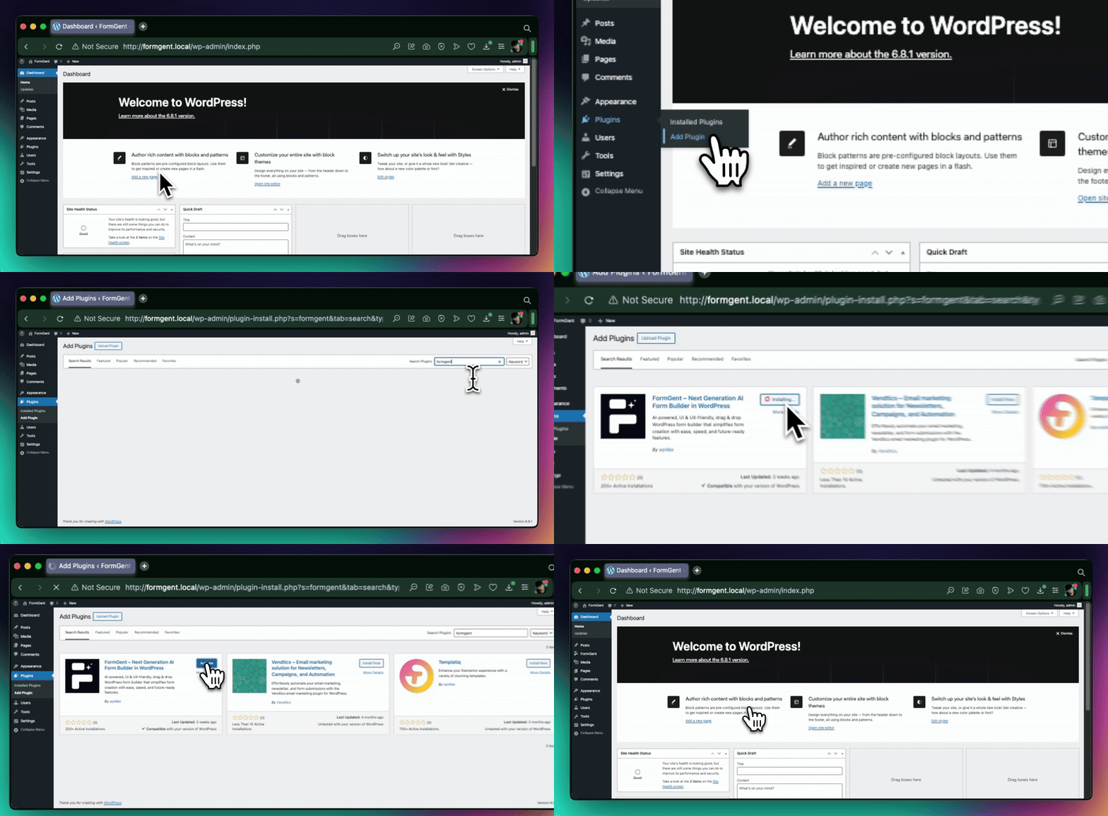
Step 1: Install Your Form Builder
Pick a tool that fits your needs and budget. FormGent is a great options that offers premium features on the free plan.
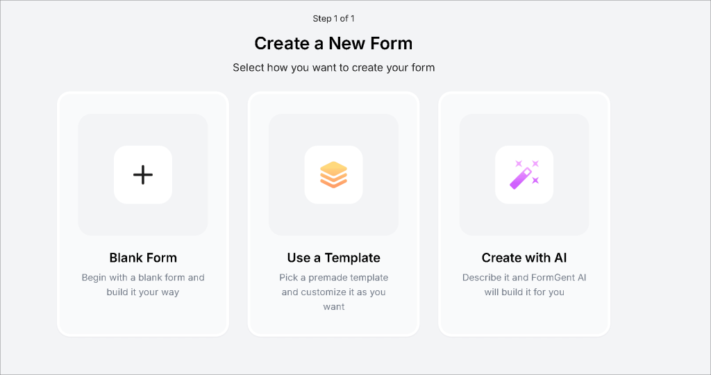
Step 2: Start With a Template or From Scratch
Most builders offer a library of ready-made templates — contact forms, registration forms, survey forms, order forms, and more. Starting with a template saves time. You customize it to fit your needs rather than building everything from zero.
If you have a very specific need, starting from scratch gives you full control over every field and section.
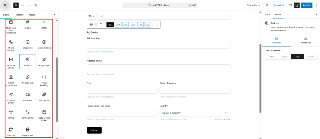
Step 3: Add and Arrange Your Fields
Drag the fields you need onto your form. Text fields, dropdowns, checkboxes, date pickers, file uploads — everything is available as a simple drag-and-drop element. Arrange them in a logical order that makes sense for the person filling it out.
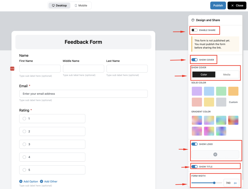
Step 4: Customize the Design
Match the form’s look to your brand. Change colors, fonts, button styles, and layout. Most builders let you do this without any design experience. Some even offer pre-designed themes you can apply with a single click.
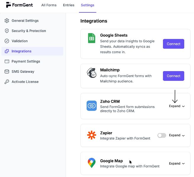
Step 5: Set Up Notifications and Integrations
Configure where form submissions go. That might be:
- Your email inbox
- A Google Sheet that logs every response
- Your CRM (like HubSpot or Salesforce)
- Your email marketing tool (like Mailchimp or ConvertKit)
Set up an automatic confirmation email so submitters know their form went through. This takes about two minutes to configure in most tools.
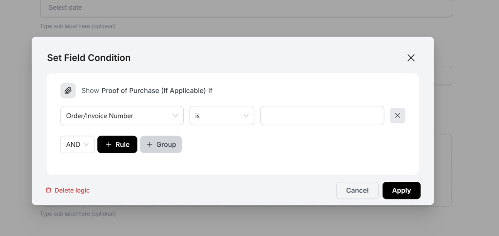
Step 6: Add Conditional Logic (If Needed)
If your form needs to show or hide fields based on answers, set up your conditional logic rules here. Most builders have a simple “if this, then that” interface that makes this straightforward even for beginners.
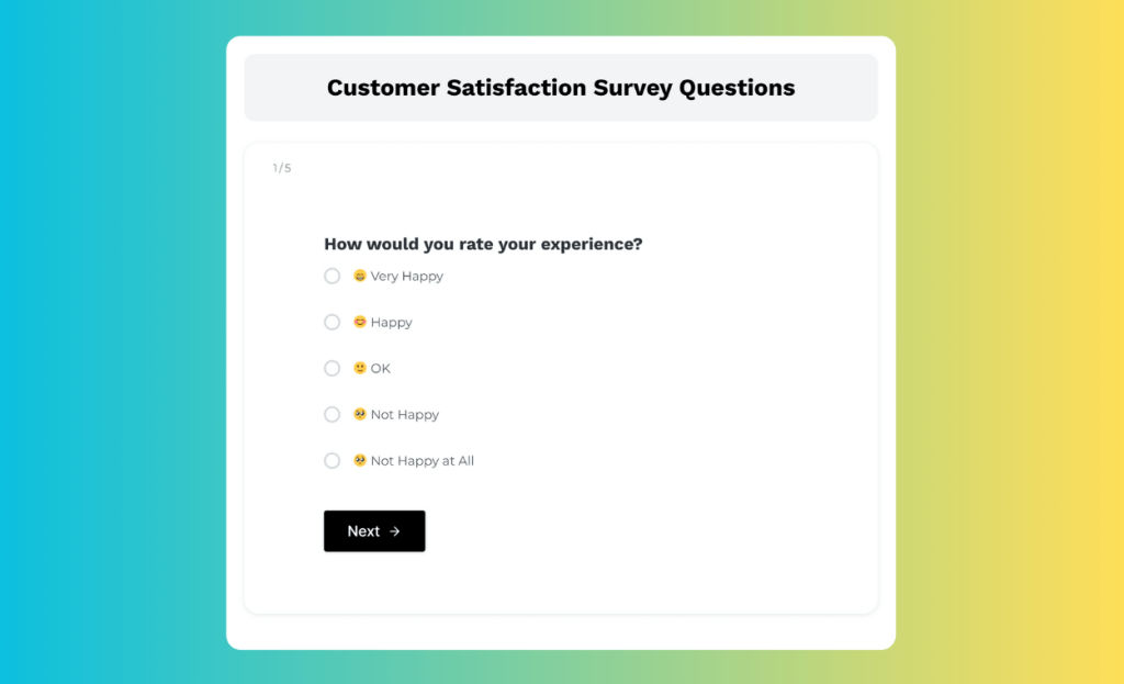
Step 7: Preview and Test
Before publishing, preview the form on both desktop and mobile. Fill it out yourself. Submit it with intentional errors to test error messages. Submit a complete version to confirm notifications are working and responses are landing in the right place.
Step 8: Publish and Embed
Once you’re happy with the form, publish it. Most builders give you two options:
- A shareable link you can send directly to people
- An embed code you paste into your website to display the form inline

Your Next Step
We’ve covered a lot of ground in this guide. Let’s bring it all together.
We started with the basics and we looked at why businesses and individuals need different types of forms because different goals require different tools. We walked through 25+ types of forms organized by purpose and explored how forms are used across industries. We also covered how to choose the right form by following the best practices. And finally, we showed you that building any of these forms that doesn’t require a developer or a single line of code.
Pick the type that fits your goal. Choose a no-code builder like FormGent that suits your needs. Start with a template, customize it for your audience, test it thoroughly, and put it to work.
You don’t need a developer. You don’t need a big budget. You just need to start.
And if you ever need a refresher on which type of form to use or how to design it better — this guide will be right here.

Rezaul Karim
Rezaul Karim is a passionate Digital Marketer driven by curiosity and creativity in the ever-evolving world of online marketing. With over 6 years of hands-on experience in Content Writing, Copywriting, SEO, and Social Media Marketing, he brings a strategic edge to crafting content that engages and converts. Always eager to explore new trends and tools, Rezaul thrives on finding smarter ways to connect brands with their audiences. Outside of work, he enjoys diving into books or recharging in nature.


The Simple Way to Create an Order Form in WordPress
August 22, 2026[…] a broader sense of what’s possible with WordPress forms beyond order forms? FormGent’s types of forms guide covers the full […]