
How to Create a Multi Step Form in WordPress (No Code)
-
- Tips and Tricks
- 9 mins read

Most WordPress forms are built as single-page forms. They work well for short use cases but problems arise when a form contains too many questions. Users are forced to scroll continuously, often losing context, focus, and motivation that results in higher abandonment rates and lower completion rates.
This is where multi-step forms work like a charm. It keeps users stay focused on one section at a time, which significantly improves usability, engagement, and overall conversion rates. If you’re wondering how to create a multi step form in WordPress without writing a single line of code, then you’ve come to the right place.
In this article, we’ll walk you through a simple, beginner-friendly approach to building multi-step forms that look professional and convert better. But before we start our procedure, let’s learn how multi step forms work and more importantly, why it’s required.
What Are Multi-Step Forms?
Studies reveal that 67% of users abandon forms due to complications – costing businesses valuable leads, sales, and insights. Your form design is directly connected with user experience and completion rate. Compliecated structure and design result in poor completion rate and user experience.
Multi-step forms completely change this scenario. Instead of displaying all questions at once, they break the form into smaller, manageable steps using page breaks. Multi-step forms make the process feel simpler, more organized, and less overwhelming.
A multi-step form is exactly what it sounds like: a long-form split into bite-sized, sequential steps. Instead of confronting users with 20 fields at once, you might break the process into 3–5 focused stages, like:
- Contact details → 2. Preferences → 3. Payment info.
Why They Matter:
Imagine climbing a staircase versus scaling a sheer cliff. Multi-step forms reduce cognitive overload by:
- Easing overwhelm: Users tackle one logical group of questions at a time.
- Guiding progress: Clear steps act like a roadmap, keeping users oriented.
- Boosting completion rates: Shorter segments feel achievable, encouraging users to finish what they start.
In a digital world where attention spans are shorter than ever, multi-step forms aren’t just a design trend – they’re a necessity for anyone prioritizing user experience and results.
Benefits of Multi-Step Forms
1. Enhanced user experience
Imagine staring at a 20-field form demanding everything from your shoe size to your astrological sign. Overwhelming, right? Multi-step forms tackle this by breaking the process into bite-sized steps, reducing cognitive load—the mental effort required to process information. By presenting only a few fields at a time, users avoid decision fatigue, a psychological phenomenon where too many choices lead to frustration or abandonment.
For example, a SaaS company’s signup form might split “Account Creation” into three steps: (1) email and password, (2) profile details, and (3) preferences. This approach mirrors how humans naturally tackle complex tasks—one piece at a time. The result? A frictionless experience that keeps users engaged.
2. Higher conversion rates
If users aren’t overwhelmed, they’re more likely to finish what they started. Companies leveraging multi-step forms often see staggering improvements in completion rates. Take, for instance, a case study by Formstack, where a healthcare provider redesigned a lengthy patient intake form into a 4-step flow and saw a 300% increase in submissions.
Why does this work? Multi-step forms create a sense of progress. Each “Next” click feels like a mini-accomplishment, nudging users closer to the finish line. A/B tests consistently reveal that splitting forms into steps outperforms single-page layouts, especially for lengthy or complex processes like e-commerce checkouts or subscription sign-ups.
3. Better data quality
When users rush through a cluttered form, errors creep in. Multi-step forms combat this by focusing attention on specific fields. For instance, a travel booking form might first ask for trip dates, then traveler details, and finally payment info. This segmentation reduces typos and incomplete responses because users aren’t juggling multiple inputs at once.
Real-time validation amplifies this benefit. If a user skips a required field or enters an invalid phone number, the error is flagged immediately—before they advance to the next step. This proactive approach ensures cleaner data for businesses and fewer headaches for users.
4. Flexibility for personalization
Multi-step forms shine when paired with conditional logic. By tailoring questions based on prior answers, you create a dynamic experience that feels custom-built for each user.
For example:
- A B2B software demo request form might ask, “What’s your role?” in Step 1.
- If the user selects “IT Manager,” Step 2 could focus on technical requirements.
- If they choose “Marketing Director,” the next step might prioritize campaign integration questions.
Tools like Typeform and Jotform make this easy, allowing businesses to hide irrelevant fields and shorten the process for users. Personalization not only boosts completion rates but also yields richer, more actionable data—because you’re asking the right questions to the right people.
Multi-step forms aren’t just a design trend, they’re a strategic tool. By enhancing user experience, lifting conversions, improving data accuracy, and enabling personalization, they turn tedious tasks into seamless interactions. Ready to plan your first multi-step form?
Planning Your Multi-Step Form
1. Define the purpose
Start with clarity: What is the form’s ultimate goal?
Before designing a multi-step form, pinpoint its primary objective. Are you collecting leads, processing payments, onboarding users, or gathering feedback? The purpose dictates the structure, tone, and complexity of your form.
Examples of common goals:
- Registration/Sign-Up: Capture user details for account creation (e.g., email, password, preferences).
- Checkout: Guide customers through billing, shipping, and payment (e.g., e-commerce).
- Applications: Collect detailed information (e.g., job applications, loan requests).
- Surveys: Uncover insights through segmented questions (e.g., customer feedback).
Why this matters:
A well-defined purpose ensures every step serves the end goal. For instance, a checkout form prioritizes speed and trust, while a survey focuses on engagement and depth.
Pro Tip:
Avoid combining unrelated goals (e.g., mixing lead generation with product feedback). Stay focused to prevent user confusion.
2. Organize the content
Break down the form into logical, bite-sized steps.
Once the purpose is clear, categorize fields into groups that feel intuitive to users. Each step should represent a single theme or action to reduce cognitive overload.
Example Flow for an E-Commerce Checkout:
- Step 1: Contact Information (Email, Phone)
- Step 2: Shipping Address (Street, City, ZIP Code)
- Step 3: Payment Details (Card Number, Expiry Date)
- Step 4: Order Review & Confirmation
Best Practices:
- Group Related Fields: Keep similar inputs together (e.g., name, email, and phone in a “Contact Info” step).
- Prioritize Essentials: Place critical fields (e.g., email for lead gen) early to capture key data even if users abandon them later.
- Limit Fields Per Step: Aim for 3–7 fields per step to maintain momentum.
Avoid:
- Overloading a single step with too many questions.
- Mixing unrelated topics (e.g., asking for a shipping address and dietary preferences in the same step).
3. Map out the user journey
Visualize the flow to eliminate friction.
Sketching the user’s path helps identify pain points and ensures a seamless transition between steps. Consider how users will navigate forward, backward, or correct errors.
Key Elements to Map:
- Progress Indicators: Show users where they are (e.g., “Step 2 of 4”) to reduce anxiety.
- Back Buttons: Allow easy navigation to previous steps without losing data.
- Error Handling: Plan for real-time validation (e.g., highlighting incomplete fields before moving forward).
- Confirmation Step: Include a final review screen to let users verify details before submission.
Tools to Use:
- Flowcharts: Tools like Lucidchart or Miro to diagram the journey.
- Wireframes: Platforms like Figma or Adobe XD to mock up the form’s layout.
- User Testing: Validate the flow with a small group to spot bottlenecks.
Example Scenario:
Imagine a job application form:
- Step 1: Personal Info → Step 2: Resume Upload → Step 3: Skills Assessment → Step 4: Review & Submit
If a user forgets to upload a resume in Step 2, the form should flag the error before they proceed to Step 3.
Why This Works:
A mapped journey minimizes frustration, builds trust, and increases completion rates. Users are more likely to finish a form that feels predictable and forgiving.
Final Checklist for Planning:
✅ Align steps with the form’s core purpose.
✅ Group fields logically and limit per-step questions.
✅ Design a clear, navigable path with error recovery.
By investing time in planning, you’ll create a multi-step form that feels effortless, not exhausting. Next, we’ll explore how top brands leverage these principles in real-world examples.
How to Create a Multi Step Form in WordPress
To create a multi step form, we’re going to use FormGent which is a Free AI-powered WordPress form builder plugin. It makes multi step form building easy by enabling page break field in Free plan meaning you don’t need to buy any plan to get started. All you need is WordPress and this form plugin. Here are the steps to follow to build a multi step form in WordPress without writing any code:
Step 1: Install and Activate FormGent
First, install the FormGent plugin on your site. Check out this step by step documentation to get started.
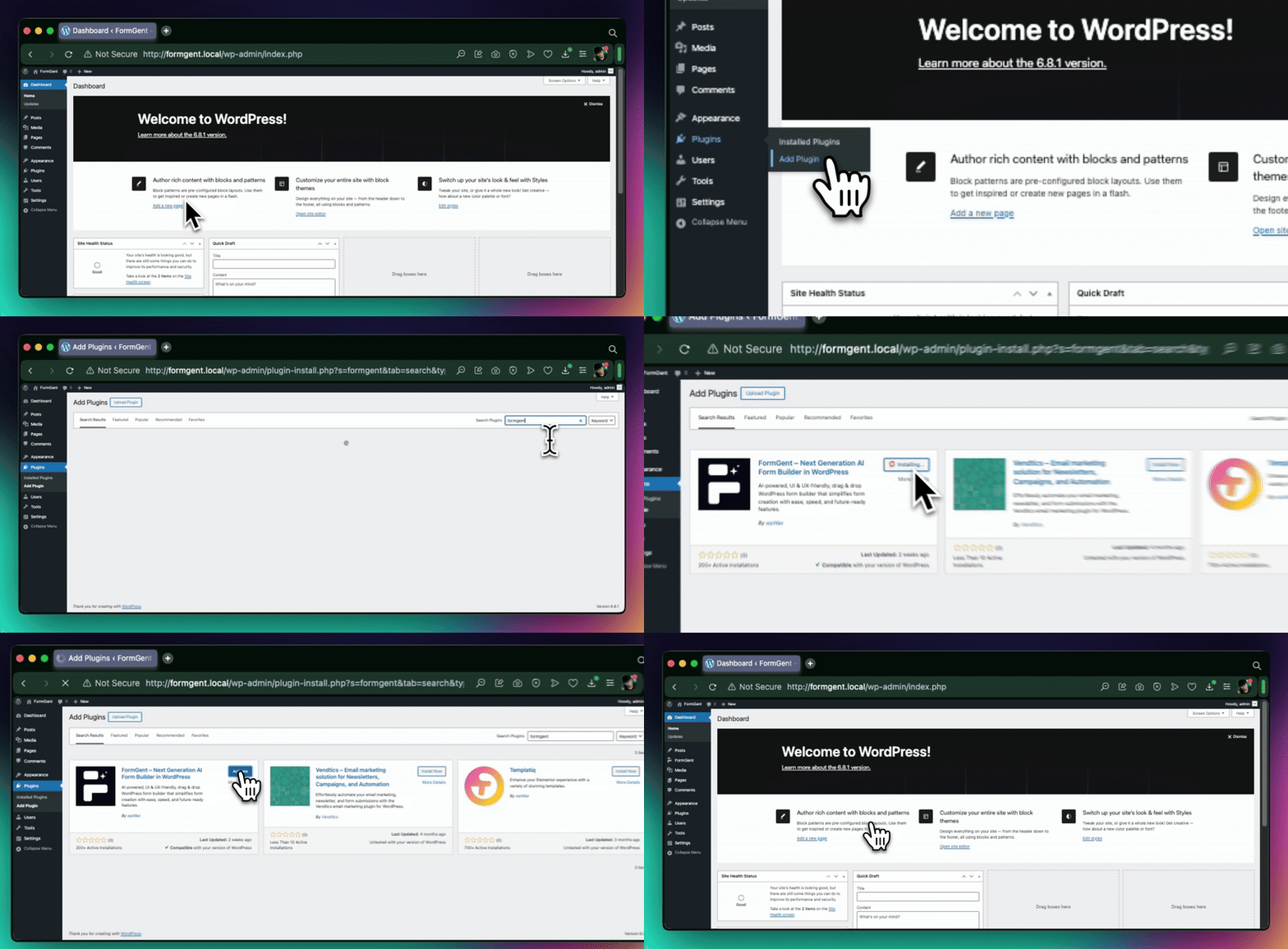
After installing FormGent, you’ll find it in the left sidebar of your dashboard. Using FormGent, you can create any type of online form in two ways. One is by manual, another one is by using AI capabilities.
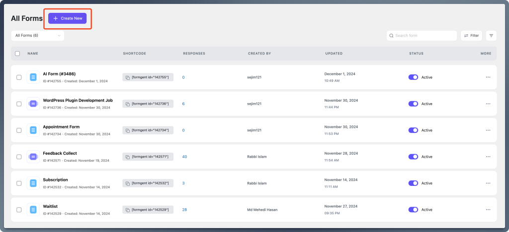
First, I’m sharing how you can create a multi step form from scratch. To do so, go to the FormGent located on the left sidebar, and click to move further. Then you’ll be taken to the FormGent Interface where you’ll find the Create New form option.
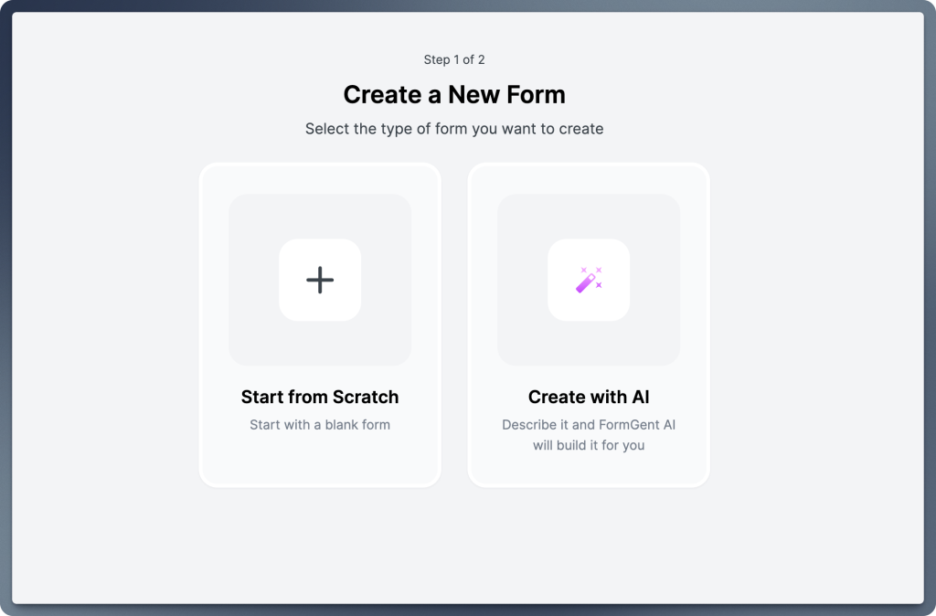
With FormGent, you can create online forms using two methods: Start from Scratch or Create with AI. The AI-powered creation also builds multi-step form the way you want. However, for demonstration purpose, we’ll build from scratch. Select the “+” icon above “Start from Scratch” to begin.
You’ll be taken to a page where you need to choose the Conversational Form option.
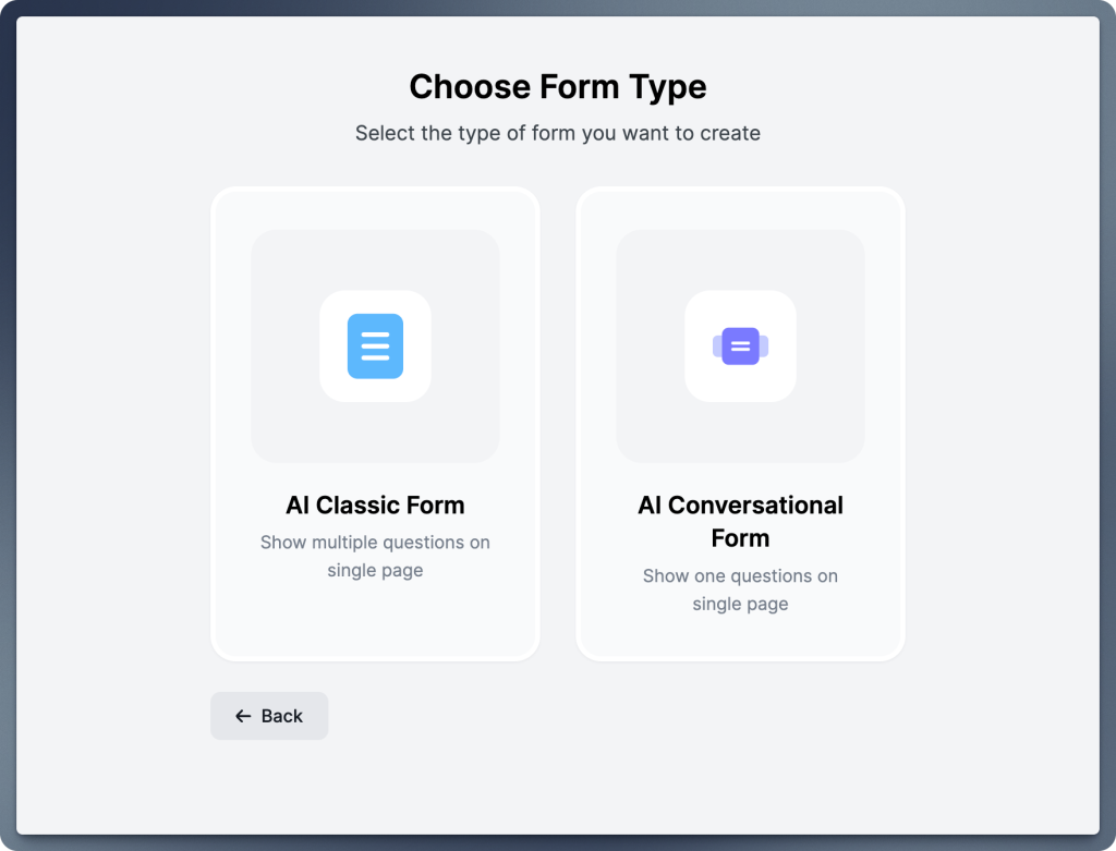
Click on the Conversional Form, a pop-up will appear to give a form name.
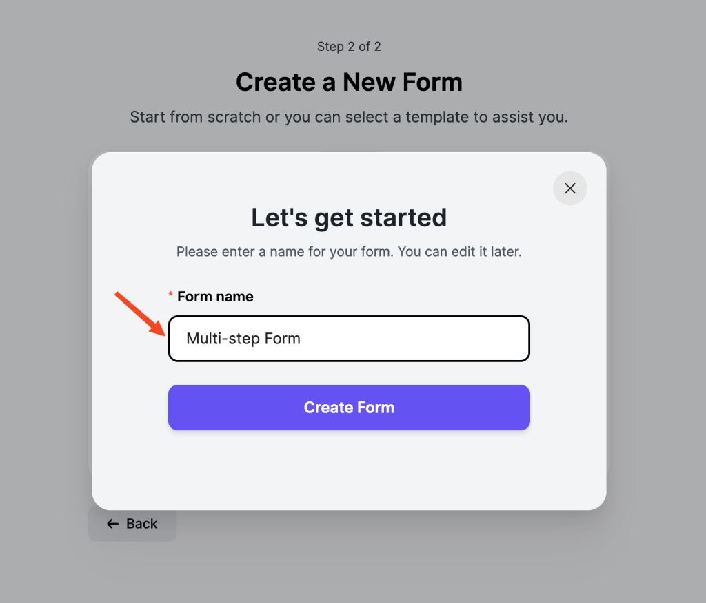
Once, you give the form name, you’ll be taken to the block-based manual form builder option of FormGent.

Now, you have full control over customizing your form by adding the necessary elements. Since we are creating a multi step form, we will begin by adding a Page Break field from the form editor.
Step 2: Add a page break element
Choose the Page Break element from the left sidebar of your plugin’s dashboard.
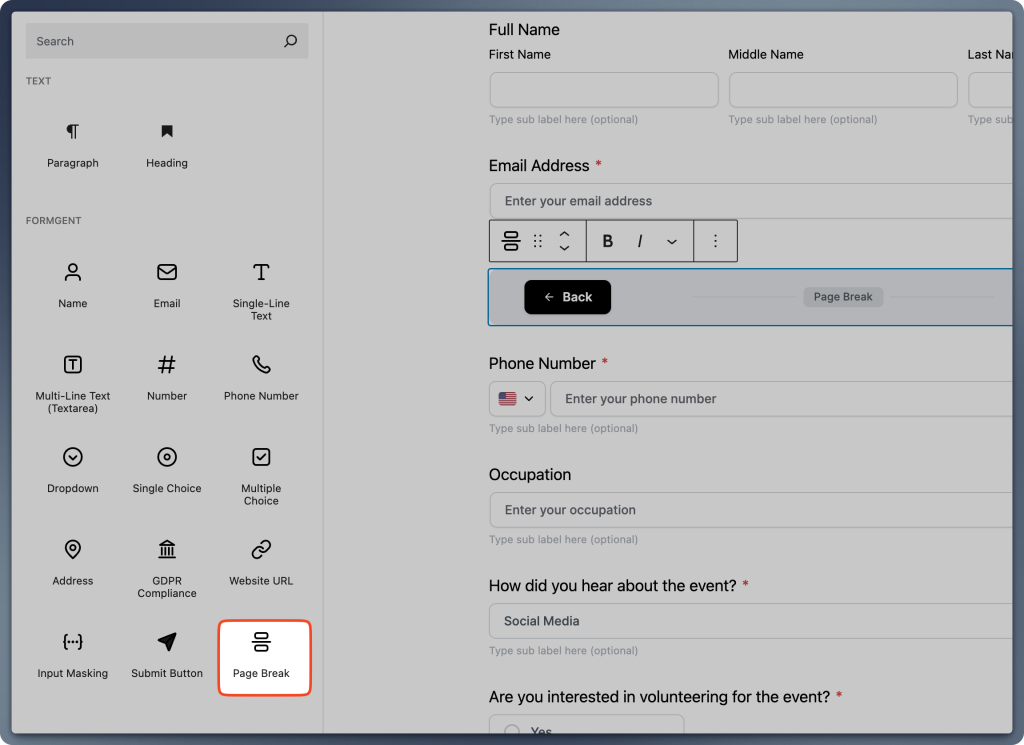
Drag the Page Break element to the desired point in your WordPress form builder. This marks the end of a step.
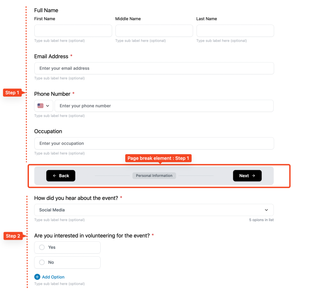
That means fields before the first Page Break belong to Step 1. Fields after the first Page Break belong to Step 2, and so on.
N.B: IMPORTANT: Ensure you add a Page Break at the very end of your form. Without it, the multi-step functionality won’t work correctly.
Step 3: Customize step names
Each Page Break element comes with a default label as I shared in the 1st step. You can rename it based on the form’s purposes, such as ‘Personal Details’, ‘Appointment Information‘, or ‘Payment Details‘.
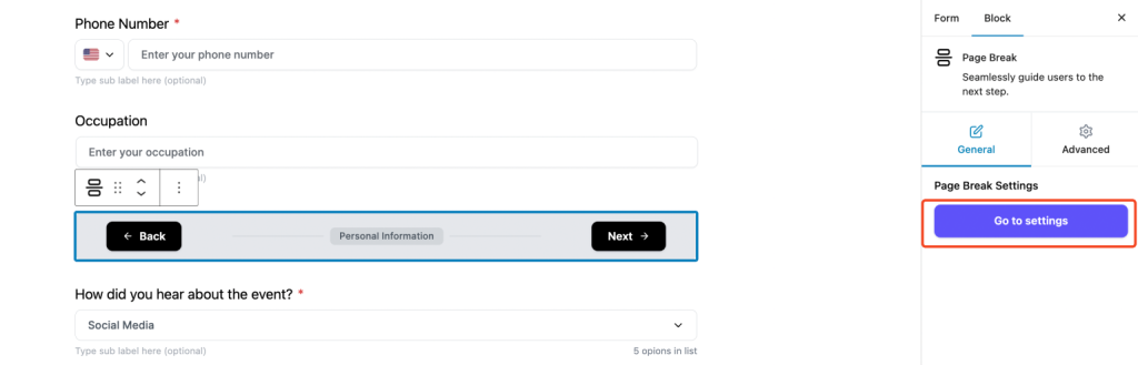
Step 4: Configure page break settings
Once you define the label of the Page Break element, Click on the Page Break element → Go to Settings to access its settings in the Page Break Settings panel. You can show and hide each label and set up the Progress Bar or Steps to show a visual representation of completion progress using the PROGRESS INDICATOR option that you want to show in your multi step form.
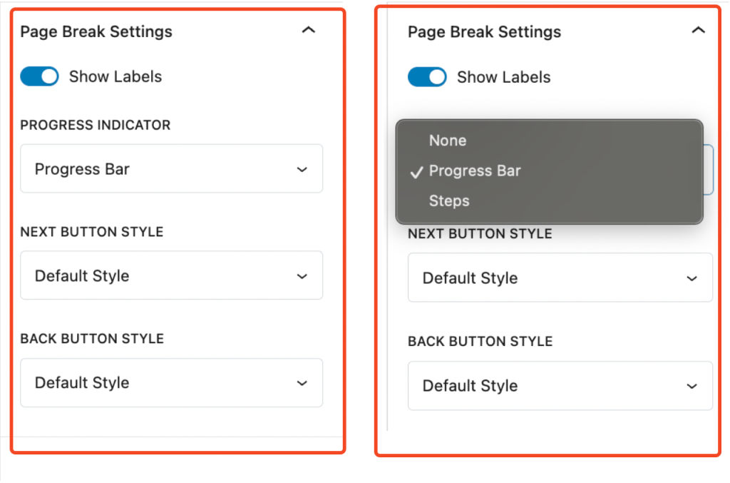
Also, you can customize the button style using the BACK BUTTON STYLE option.
Step 5. Finalizing the design
Once you’ve added all the Page Breaks and adjusted settings, your form will appear as a sleek, structured, and easy-to-navigate multi-step form. Users can seamlessly move between sections using the Back and Next buttons.
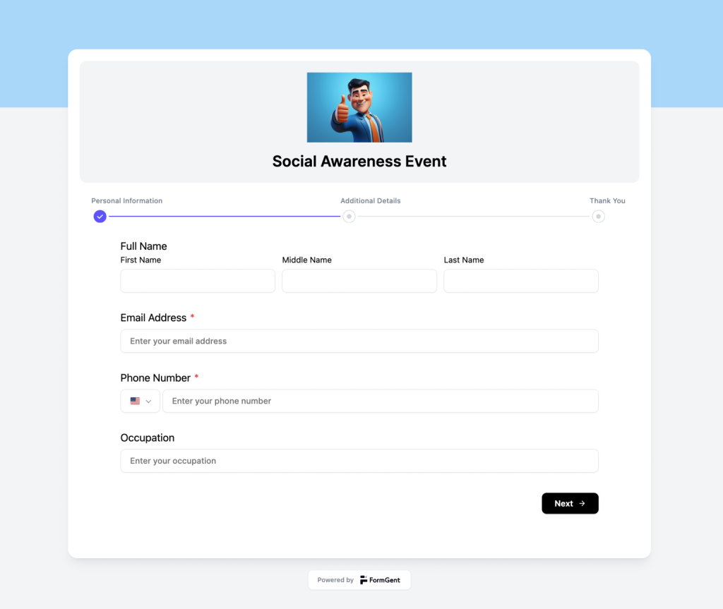
With this approach, you can create highly engaging multi step forms that enhance usability, reduce form abandonment, and improve user satisfaction. Start building intuitive multi-step forms today with FormGent!
Embedding the created form into the desired page
Once the form is created; now, you have the freedom to use it on any of the pages of your website using the shortcode.
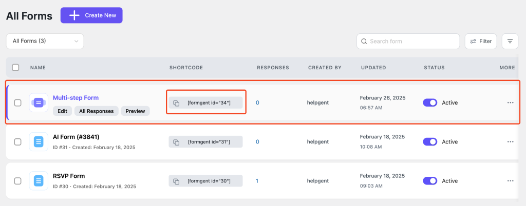
That’s it!
Final Words
Creating a multi-step form doesn’t have to be an intimidating process. By breaking down complex tasks into manageable steps, you can significantly enhance user experience, boost completion rates, and gather accurate data with ease.
Whether you’re using no-code WordPress form builder like FormGent or diving into custom development with frameworks like React, the key lies in thoughtful planning, intuitive design, and continuous optimization.
Remember, the success of your multi-step form depends on understanding your users’ needs and expectations. Keep your forms simple, visually engaging, and mobile-friendly while leveraging features like progress indicators, real-time validation, and conditional logic to guide users seamlessly through each step.
And don’t forget to test rigorously – usability testing and analytics will help you identify areas for improvement and ensure your form performs at its best.


The Simple Way to Create an Order Form in WordPress
September 13, 2026[…] event details, customer notes? That’s when things start to feel cluttered on one page. A multi-step form fixes that. Add a page break, and you split the product selection from the customer-details […]