
10 Essential Tips for Creating an Effective Contact Page Design
-
- Tips and Tricks
- 9 mins read
Your website’s contact page is often the first point of interaction between your business and potential customers. A well-crafted contact page design not only enhances user experience but also boosts lead generation and conversions. In this article, we’ll explore actionable tips and best practices to help you create a professional, user-friendly contact page that drives results.
Why Is Contact Page Design Important?
A contact page serves as a bridge between your audience and your business. Whether users are looking for support, collaboration opportunities, or simply more information, your contact page design plays a critical role in making their journey seamless.
An optimized contact page design ensures that visitors can easily find what they need without frustration. It builds trust, encourages engagement, and ultimately contributes to your business goals. A poorly designed contact page, on the other hand, can lead to missed opportunities and lost leads.
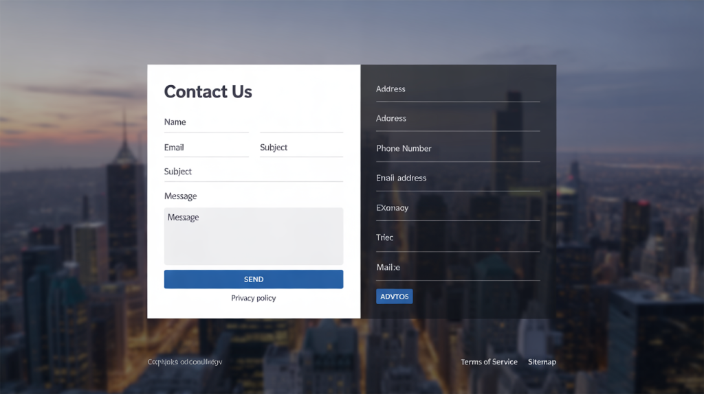
Key Elements of an Effective Contact Page Design
To create a contact page that converts, focus on these essential elements:
- Clear Call-to-Action (CTA)
- Contact Form Position
- Contact Form Fields
- Mobile Responsiveness
- Contact Information Visibility
- Location and Hour Declaration
- Visual Consistency
- Trackable Design
- Thank You Message
- Friendly Security Check
1. Clear Call-to-Action (CTA)
Your CTA should be prominent and action-oriented. Often businesses label their Call-To-Action button as Learn More or Request Service. Whereas these action labels seem suited to their business, it may make the visitor feel less valued. Most customers would like to get in touch with a representatives or get a call instead of just requesting something. To make them more comfortable, use phrases like “Get in Touch” or “Contact Us Today” as an invitation.
CTA button position is another matter of consideration based on various statistics and website experiences. Experts say, place the CTA button above the fold so it gets immediate visibility when someone lands on your contact page. Modern website conversion is largely based on User Experience (UX) rather than just fancy design.
2. Contact Form Position
Many companies design a contact us in a manner where they put out a lot of sections containing values and statements. Let’s be real; do the users click Contact Us button to read all these paragraphs? Most of them simply visit the page to see the contact information such as email, phone number or the address. Some also land on the contact us page for a quick form submission only.
Position your contact form where users expect to find it – that’s the best idea. Typically users expect the form to be near the top or center of the page. Make sure that the form is taking enough space on the page so that users do not hesitate to put their information on fields.

3. Contact Form Fields
Another big mistakes many businesses do is the form structuring. They create fields that are not required and filters that can be done later. Not only it repels visitors from submission but also takes away a lot of their time, resulting in a lower form completion rate. Best solution to such problem is a conversation form if you can design one.
A vital tip is to keep the form fields minimal. For example, include required fields like name, email, phone and add filtering fields such as drop down, slider or short answer to reduce friction and improve completion rates. Do not offer large text boxes that users need to fill up and optimize them to limited answering options with checkbox or rating scale type fields.
4. Mobile Responsiveness
With over half of web traffic coming from mobile devices, it’s important for websites to have a mobile-friendly or even Mobile-first contact page design. Whether you are collecting appointments, feedback, survey response, leads or job applications, be sure that majority of the responses will be submitted from a mobile device.
Ensure that your contact page design is mobile-friendly, it is non-negotiable. Test the page on various screen sizes to confirm it looks great and functions smoothly. You can also use Am I Responsive tool to identify responsiveness flaws.
5. Contact Information Visibility
Many visitors land on the contact page to find contact information so that they can make quick contact with the businesses. However, to avoid spam or scamming, businesses often do not display any of their contact information. Rather, they only put out a contact form so that visitors can request call or email contact.
Although, it is personal and strictly business decision, it is standard practice to keep at least one email or contact number visible. Also for clarity, you may put out their mailing address or registered location visible.
6. Location and Hour Declaration
For physical businesses and multi-branch franchise, it is important to display businesses hours and locations clearly. Most visitors visit contact us page only to find nearest outlet or branch location and business hours.
You may use a plugin to integrate with Google Map to display your location(s) and highlight Google My Business working hours on your website. Do mention the days when your outlet or branch remains closed to avoid schedule conflict.
7. Visual Consistency
The visual interface of the contact us page design must match the color and contrast of the website itself. Many businesses import contact page design from another website or theme that does not align with their main website designs. As a result, visitors feel alienated when they land on the page.
While maintaining the color consistency on contact page along with other pages, use a lot of whitespace, global site typography, and color guideline to create a clean and organized layout. A visually appealing contact page helps users navigate effortlessly and focus on key elements like the form or contact details.
8. Trackable Design
You may find out that visitors are coming to the contact us page but not submitting any response. Wondering why this happen? To find out, you need a trackable design that can be analyzed using Google Analytics 4, Microsoft Clarity or Hotjar. This way you will be able to uncover many hidden insights such as which field users click the most or where do they abondon the form.
To track your contact page, first you need to use a clean design with minimal HTML and CSS. The above mentioned tools may often fail to track design if they are complex in structure. Reduce using heavy CSS or complex Javascript on the contact page because this is where the actions take place.

9. Thank You Message
While many websites has a clean and intrusive contact us page design in place, they make mistakes in showing a confirmation message. As a result, visitors gets confused whether their response was recorded or not. The consequence is multiple, either visitors keep submitting duplicate responses or out of frustration, they opt-out and go to a competitors’ page.
The solution is to display a completion or confirmation message once the visitor submit a response. The message can be shown as a popup or a single one line text beneath the form once response is submitted. This way, users will be assured that their efforts have been stored and someone will get back to their requests.
10. Friendly Security Check
Many websites place a security check such as reCAPTCHA to make sure that form submissions are only used by human and not any bots. Naturally, webmasters would want their sites to be secure and safe from any outside attack, they also need to make sure that it is not annoying users.
Use a single security checker such as reCAPTCHA, I agree checkbox or simple match CAPTCHA that users can complete quickly. Reduce multiple checkboxes and unnecessary steps. Completion rate of your form is largely dependant on this step.
Best Practices for Contact Us Page Design
Follow these best practices to take your contact page design to the next level:
- Keep It Simple: Avoid overwhelming users with too much text or unnecessary visuals. Stick to the essentials.
- Use Visuals Strategically: Incorporate icons, images, or illustrations to break up text and make the page more engaging.
- Add Trust Signals: Include testimonials, security badges, or certifications near the form to reassure users about sharing their information.
- Optimize Loading Speed: Slow-loading pages frustrate users and harm SEO. Compress images and minimize code to ensure fast performance.
- Integrated Plugin: Use an advanced contact form plugin that integrates with other automation tools to make sure that users get quick response upon submitting their request.
- Utilize Templates: Reduce effort and boost performance with ready-made resources by using a minimal contact page design template. There are many available templates in popular marketplaces.
Remember, your contact page design should prioritize simplicity and functionality to deliver a seamless user experience.
Examples of Great Contact Page Designs
Looking for inspiration? Here are three examples of websites with exceptional contact page designs :
- Apple Support: Apple’s contact page uses a clean layout with clear categories for different types of inquiries. The minimalist design aligns perfectly with their brand identity. You can consider this as a visual reference and develop your contact us page template around it.
- Mailchimp: Mailchimp’s contact page features a friendly tone, helpful FAQs, and a straightforward form. It’s both functional and approachable that can be your benchmark if you have a similar (SaaS) service.
- HubSpot: HubSpot combines a sleek design with multiple contact options (phone, email, chat). Their contact page design caters to diverse user preferences. They also included various geolocations where their physical offices are available to further help.
These examples demonstrate how a thoughtful contact page design can elevate user engagement and satisfaction.
Common Mistakes to Avoid in Contact Page Design
Even small mistakes can undermine the effectiveness of your contact page. Here’s what to avoid:
- Overloading Information: Too much text or cluttered visuals can confuse users.
- Poor Form Placement: If the form is buried at the bottom of the page, users may miss it entirely.
- Missing Essential Details: Always include basic contact information like phone numbers, email addresses, or physical locations.
- Not Testing Functionality: Ensure the form works correctly across all devices and browsers.
Avoid these pitfalls to ensure your contact page design serves its purpose effectively.
Tools and Resources for Building a Contact Page
Creating a professional contact page design doesn’t have to be complicated. Here are some tools and resources to simplify the process:
- WordPress Plugins: Use plugins like FormGent or other popular form builders to build customizable contact forms.
- Drag-and-Drop Builders: Tools like Elementor or Divi make it easy to design responsive pages without coding.
- Inspiration Platforms: Explore Behance or Dribbble for creative ideas and trends in contact page design .
With the right tools, creating a polished contact page design becomes effortless.
Optimize Your Contact Page for SEO
Search engine are a popular channel for driving organic traffic to your contact page. Hence, optimizing your contact page with high-effort SEO discipline is crucial. Follow these tips to optimize your contact page design for improving lead quality:
- Use Descriptive Headings: Include keywords like “Contact Us” or “Get in Touch” in your headings. Also add sub-headings explaining who can contact you such as; clients, partners or suppliers.
- Add Alt Text for Images: Describe any visuals on the page using alt tags to improve accessibility and SEO. This helps search engine understand what the image is about even when it’s not loading properly. You can use AI to generate Alt text and an AI detection tool to humanize the text.
- Implement Schema Markup: Use structured data to highlight your contact details for search engines.
- Balance Keyword Usage: Naturally incorporate variations of the focus keyword (e.g., “contact number of XXX LLC.”) without overstuffing.
By optimizing your contact page design for search engines, you’ll increase visibility and attract more visitors which may lead to enhancing lead quality, boosting conversion rate and ensure sustainability.
Testing and Improving Your Contact Page Design
Continuous improvement is key to maintaining an effective contact page design. You can do a few experiments on it to find out which works better. Here’s how to refine yours:
- Conduct A/B Testing: Experiment with different layouts, CTAs, and form placements to see what works best.
- Gather User Feedback: Ask visitors for input on how to improve the page.
- Monitor Analytics: Track metrics like bounce rate, form submissions, and time spent on the page to measure performance.
Regular testing ensures your contact page design stays relevant and user-centric.
Conclusion
A well-crafted contact page design is more than just a functional necessity – it’s an opportunity to connect with your audience and drive meaningful interactions. By following the tips and best practices outlined in this article, you can create a contact page that’s both visually appealing and highly effective.
Looking for a Champion contact form builder that can enhance your contact page design? Look to further than FormGent – a powerful form builder on WordPress, that feels like a gift. Interesting part is, you can access all advanced features out there for FREE!
Also Checkout the Early Bird Deal up to 60% Off for a limited time. Grab it before time runs out.

S. M. Navid Anjum
Digital Marketing enthusiast who loves to write technical reviews and trendy contents. Currently working with WordPress Plugin Marketing and growth. Open to collaboration and co-marketing opportunities with any SaaS and plugins.

Leave a Reply