

Form Design Best Practices: How to Create User-Friendly and Conversion-Optimized Forms
-
- Tips and Tricks
- 11 mins read

Forms are one of the most critical elements of any website or app. Whether you’re collecting leads, processing payments, or gathering feedback, forms play a pivotal role in driving user engagement and achieving business goals. However, poorly designed forms can frustrate users, increase bounce rates, and hurt conversions. That’s where form design best practices come into play.
In this guide, we’ll walk you through proven strategies to create forms that are intuitive, visually appealing, and optimized for maximum usability and conversions. Let’s dive in!
Why Form Design Matters
Before diving into the specifics, it’s essential to understand why form design is so important. Studies show that 88% of online consumers abandon forms if they find them too complicated or time-consuming. Additionally, 70% of users drop off during multi-step processes due to poor design or unclear instructions.
By implementing form design best practices, you can:
- Improve user experience (UX).
- Increase completion rates.
- Build trust with your audience.
- Drive higher conversions and ROI.
Now, let’s explore the key principles and actionable tips to help you design better forms.
Form Design Best Practices
Here are best practices that serve as guiding principles for form design, offering a concise reference to enhance usability and efficiency. However, it is essential to consider the specific context of each form to determine the most effective presentation. As with many aspects of design, best practices may have exceptions based on unique requirements and user needs.
i. Use a contextual label
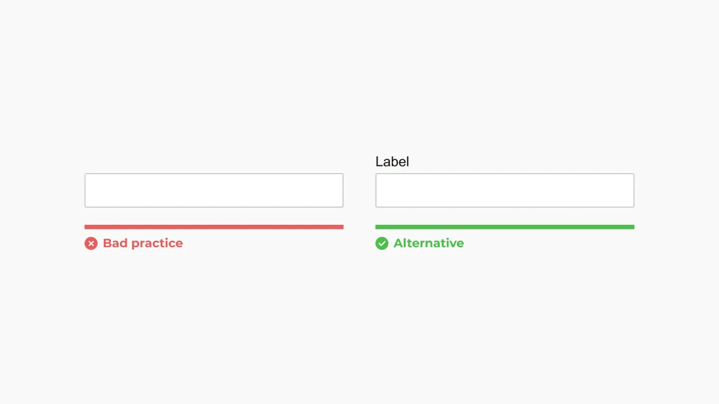
Labels play a crucial role in ensuring accessibility. Screen readers rely on them to convey information to users, making forms more inclusive. Without proper labeling, many individuals may find it difficult to navigate and interact with forms. To enhance accessibility, ensure that every form field includes a <label> element follows appropriate HTML semantics and incorporates ARIA attributes when necessary.
ii. Avoid placeholders as a label
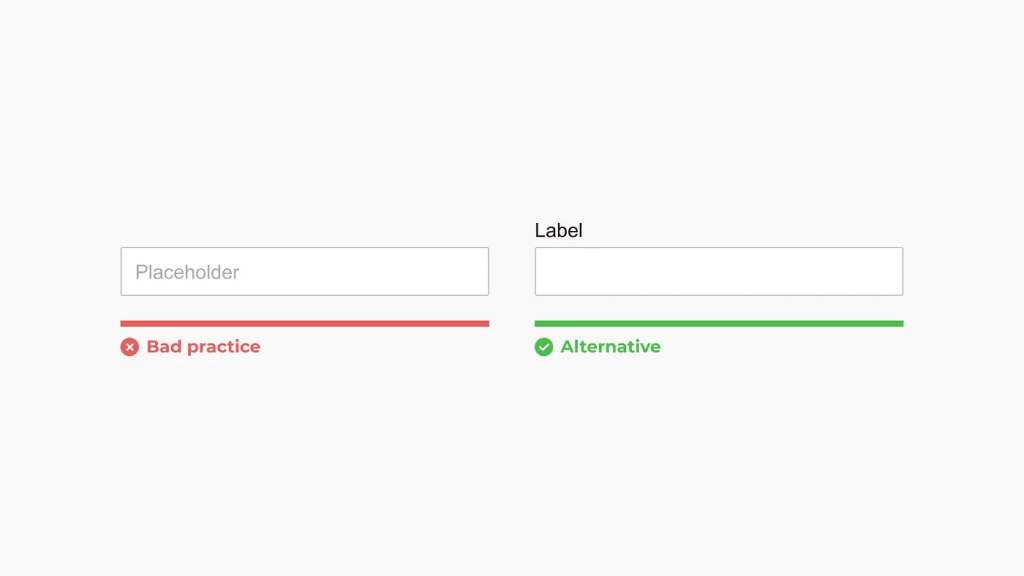
Using a placeholder as a label can impose a cognitive burden on users by relying on short-term memory. Once a user begins typing, the placeholder disappears, requiring them to delete their input to recall the original label.
Additionally, placeholders can present visibility challenges depending on their contrast. If too dark, they may be mistaken for pre-filled input, leading to confusion. Conversely, if too light, some users may struggle to perceive them, impacting usability and accessibility.
iii. Keep labels short
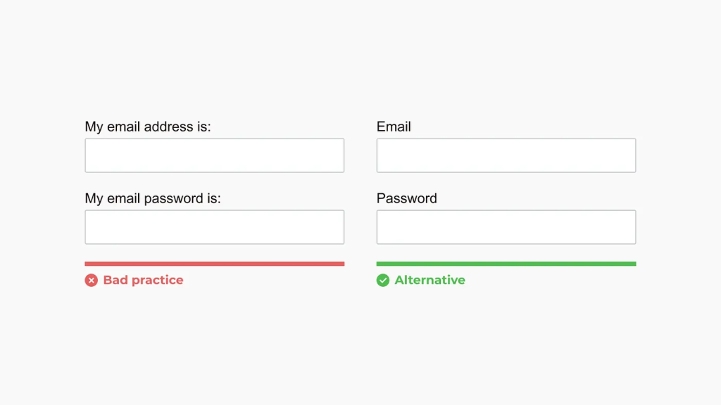
Use concise labels whenever possible to enhance readability and ensure a seamless user experience.
iv. Field length and format alignment
The field length determines the range of acceptable responses. Use this setting for fields with a specific character limit, such as phone numbers, zip codes, and similar input types.
v. Maintain Standard Form Field Design for Optimal Usability
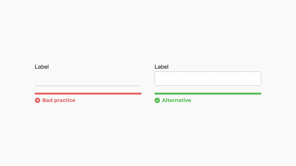
Creativity in form design, while well-intentioned, can often lead to unintended usability issues. Even the most innovative ideas, when applied to form fields, can negatively impact user experience—sometimes on a massive scale. For example, in 2017, Google quietly revised its Material Design text fields after discovering that many users were unaware they were interactive.
To ensure a seamless user experience, it is crucial to adhere to established design conventions for input fields. If you choose to deviate from standard practices, rigorous usability testing is essential to validate the effectiveness of your design and prevent accessibility challenges.
vi. Ensure Clear Differentiation of Form Fields
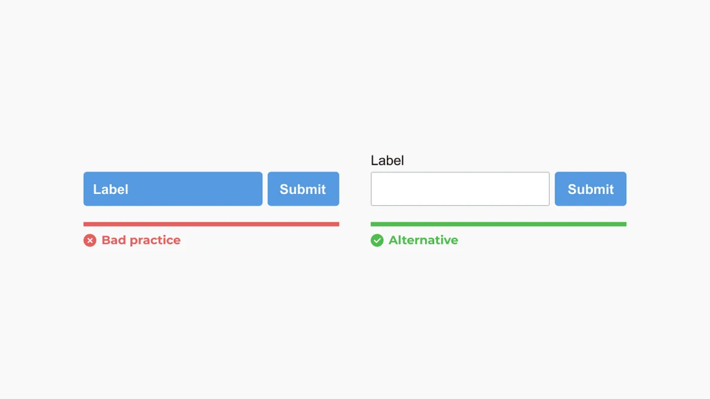
Form fields should be visually distinct to effectively convey their function. Maintain sufficient contrast and spacing to prevent user confusion and enhance usability.
vii. Utilize the Appropriate Input Types for Enhanced Accessibility and User Experience
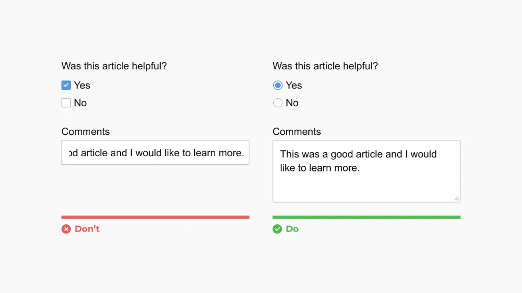
Selecting the correct input type is essential for improving form accessibility and optimizing the user experience. Proper input types ensure seamless interaction, such as triggering the appropriate keyboard layout on mobile devices (e.g., numeric keypad for number fields, standard keyboard for text inputs).
A common oversight among designers and developers is the misuse of input elements. For example, a radio button should be used for single-choice questions, whereas a checkbox is appropriate for multiple-choice selections. Implementing the correct input types not only enhances usability but also ensures a more intuitive and user-friendly interface.
viii. Forms should be structured in a single-column layout
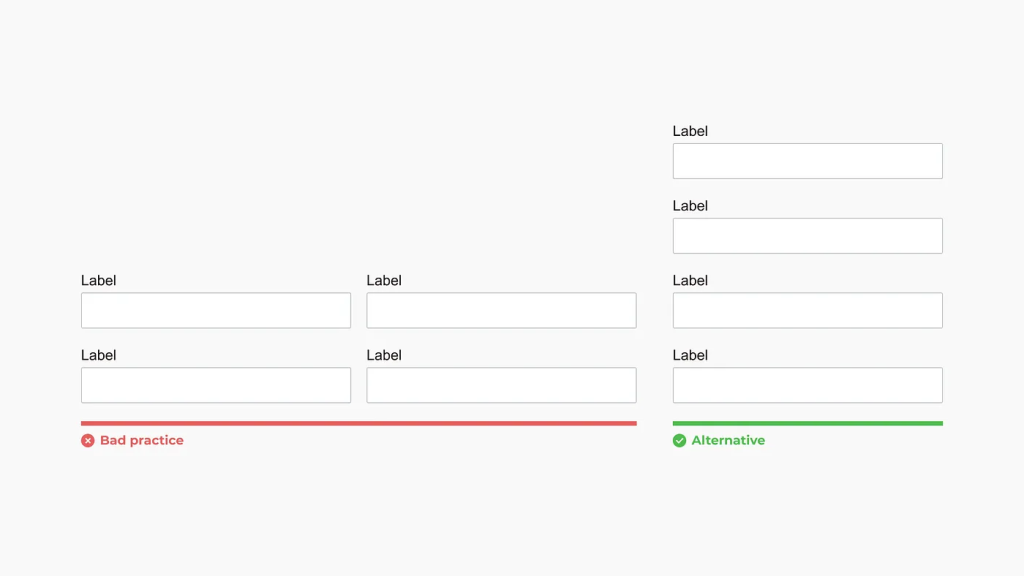
Single-column forms enhance readability, improve user experience, and ensure better compatibility with mobile devices. In contrast, multi-column layouts can overwhelm users and increase the likelihood of skipped fields.
However, as with most best practices, there are exceptions. The ideal form structure depends on the specific context and user needs. Always consider the form’s purpose and the user journey to determine the most effective presentation.
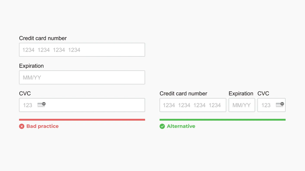
ix. Group Related Fields Inline for Better User Flow
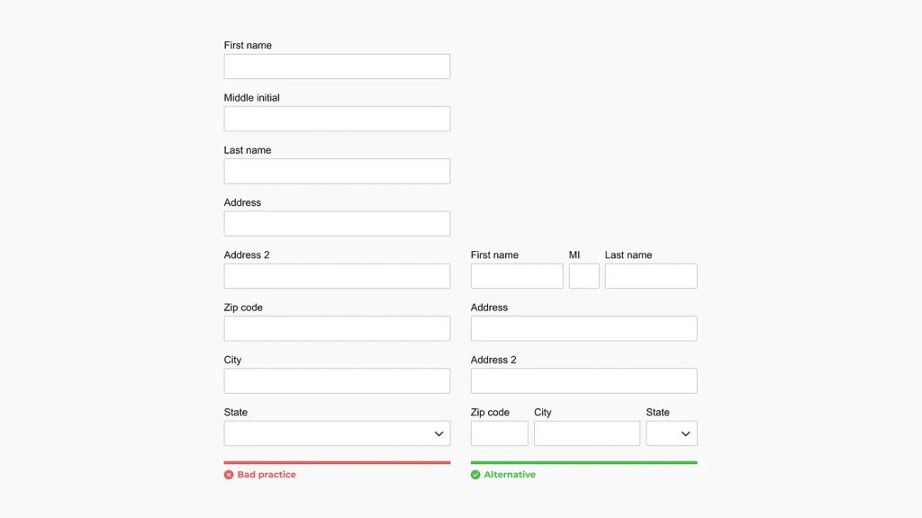
Stacking fields such as names, addresses, and payment information can introduce unnecessary friction and disrupt the user’s flow.
x. Ensure action buttons are task-specific
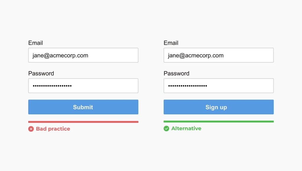
The submit button’s text should clearly and concisely describe the intended action, leaving no ambiguity about the outcome when clicked.
xi. Associate labels with their respective input fields
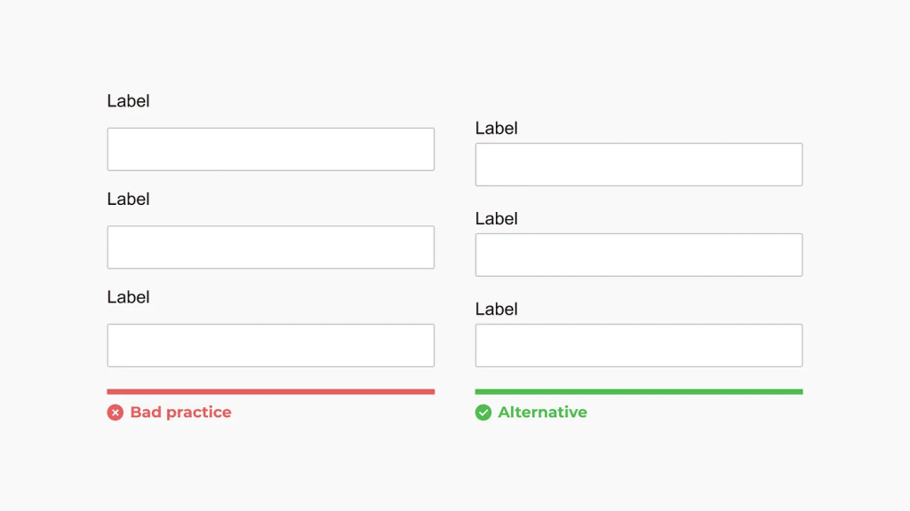
Ensure labels are positioned adjacent to their corresponding input fields to maintain clear visual and functional relationships. This practice minimizes user confusion and reduces input errors, which often arise when users scroll through lengthy forms and inadvertently associate labels with incorrect fields due to poor spatial grouping.
xi. Avoid Using All Capital Letters
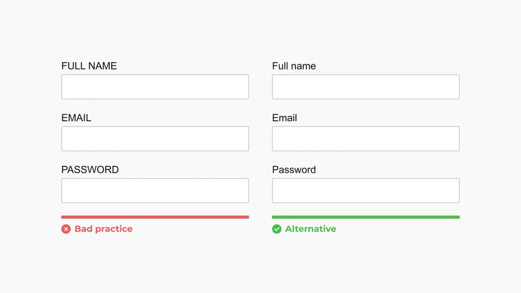
The choice between sentence case and title case is a stylistic decision, but writing in all capital letters should generally be avoided. Text formatted in all caps impairs readability and scannability, as it disrupts natural visual hierarchy and flow. Additionally, excessive capitalization can appear unprofessional and detract from the intended message. For optimal clarity and presentation, prioritize sentence case or title case in alignment with established typographic conventions.
xii. Present checkboxes and radios vertically
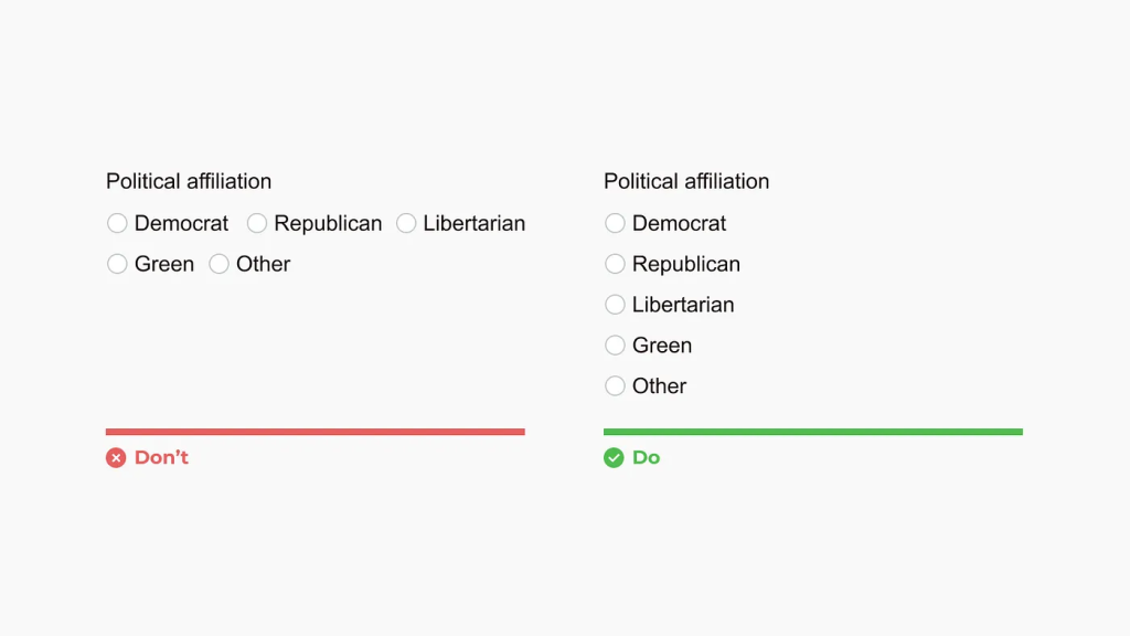
When designing forms, it’s generally recommended to present checkboxes and radio buttons in a vertical layout. This arrangement enhances readability and makes it easier for users to scan and compare the available options. However, in cases where options are accompanied by associated graphics—such as icons or images—the visual context can provide an additional layer of clarity. In such scenarios, the need for a strictly vertical presentation may be reduced, as the graphical elements help users quickly identify and understand each choice.
xiii. Show all selection options if < 6
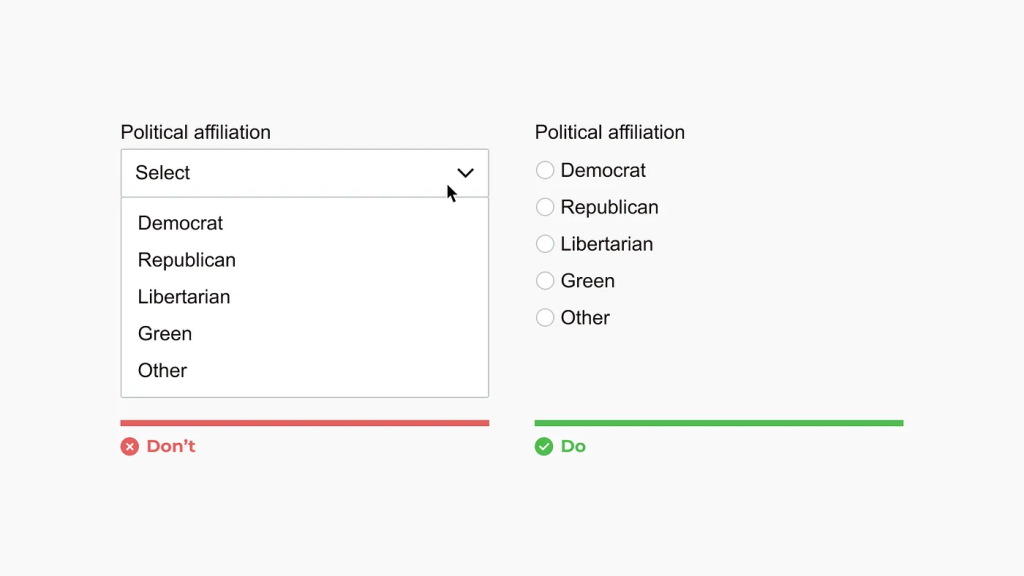
Using a drop-down selector hides available options, requiring users to make two clicks to make a selection. It is recommended to utilize a drop-down selector when there are more than five options and to incorporate a search feature within the drop-down when there are more than 25 options.
For situations where space is constrained, such as in inline editing, a drop-down selector may be appropriate even for fewer than six options.
xiv. Display errors inline
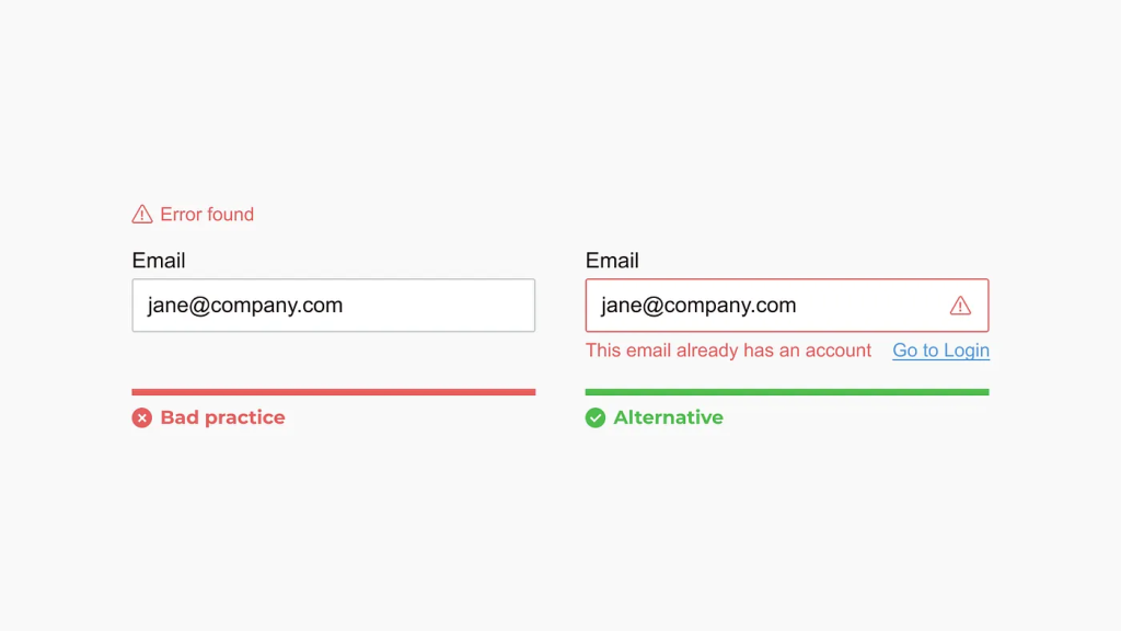
Minimize errors by ensuring clarity and precision in your communication. When an error occurs, highlight its location, provide a clear explanation of the issue, and offer guidance on how to resolve it.
xv. Group-related fields
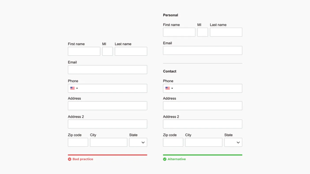
Organize fields into logical groups to enhance user comprehension and facilitate quicker interpretation of the form. This also allows for more efficient management of requests in batches.
xvi. Ensure a clear distinction between primary and secondary actions
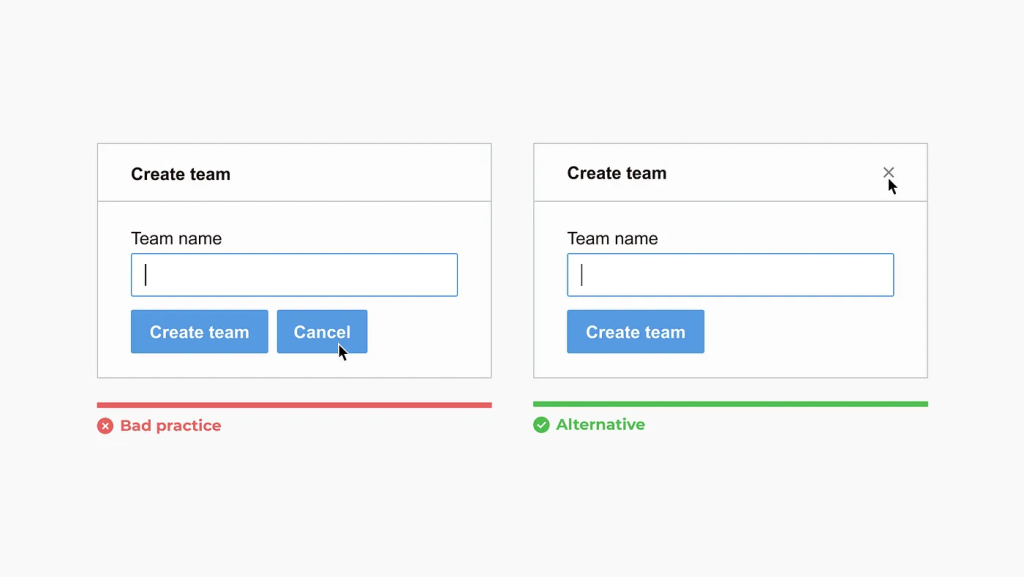
Highlight the main action, such as form submission, to ensure it stands out and reduces the risk of errors. Additionally, always evaluate whether the secondary actions are necessary.
xvii. Implement a progress indicator for multi-step forms
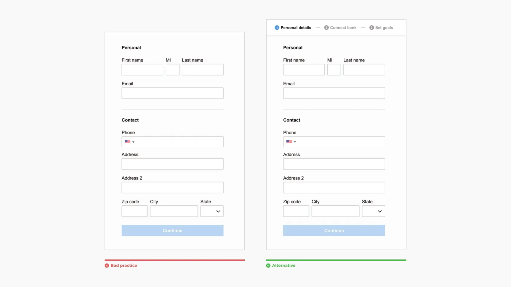
Multi-step forms, also known as form wizards, should feature a clear progress indicator to inform users of their current steps and what to expect next.
xviii. Avoid stacking modals
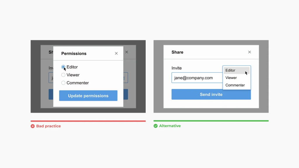
Interactions that involve multiple modals can lead to user errors. Instead, consider using inline editing within a single modal to enhance the user experience.
Always Prioritize Accessibility
Designers often overlook the importance of verifying that their designs meet accessibility standards during implementation. It is crucial to ensure that accessibility benchmarks are consistently met throughout the process.
For comprehensive guidance on how to implement accessible forms semantically, I highly recommend referring to the W3C’s detailed resources on creating websites that adhere to WCAG standards.
Accessible Form Design Checklist
(Based on WCAG 2.1 Guidelines)
1. Hints & formatting tips
- Do:
- Display hints below the input field (e.g., “Password must be 8+ characters”).
- Keep hints visible while the field is focused or filled.
- Use
aria-describedbyto programmatically link hints to the input.
- Avoid:
- Using placeholder text for critical instructions.
- Hiding hints on blur.
Example:
<label for="password">Password</label>
<input type="password" id="password" aria-describedby="password-hint">
<div id="password-hint" class="hint">Use 8+ characters with a mix of letters and numbers.</div>
2. Placeholder text & floating labels
- Placeholder Text:
- Use only for non-essential examples (e.g., “[email protected]“).
- Ensure low contrast (e.g.,
#767676on white) to avoid confusion with actual input.
- Floating Labels:
- Labels move above the input when focused/filled.
- Use distinct styles for “filled” vs. “unfilled” states (e.g., color change, bold labels).
Example (Floating Label):
.label-floating {
  position: absolute;
  left: 12px;
  top: 12px;
  transition: 0.2s;
  pointer-events: none;
}
.input-field:focus + .label-floating,
.input-field:not(:placeholder-shown) + .label-floating {
  top: -10px;
  font-size: 12px;
  color: #0066cc;
}
3. Vertical layout for labels & fields
- Stack labels above fields in all screen sizes to avoid horizontal scrolling.
- Use a single-column layout for better screen-magnifier compatibility.
Example:
<div class="form-group">
  <label for="name">Full Name</label>
  <input type="text" id="name">
</div>
4. Error messaging
- Do:
- Add text-based error messages (e.g.,
<span class="error">Error: Invalid email</span>). - Include an error icon (e.g., ⚠️) with
aria-hidden="true"for visual users. - Use
aria-invalid="true"andaria-live="polite"for screen readers.
- Add text-based error messages (e.g.,
- Avoid:
- Relying solely on color (e.g., red borders).
Example:
<div class="form-group">
  <label for="email">Email</label>
  <input type="email" id="email" aria-invalid="true" aria-describedby="email-error">
  <span id="email-error" class="error" aria-live="polite">
    ⚠️ <span class="sr-only">Error:</span> Invalid email format.
  </span>
</div>
5. Label & input interaction
- Do:
- Use
<label for="input-id">to focus inputs. - Add separate “info” links for additional details (e.g., ℹ️ icon with
aria-label="Password requirements").
- Use
- Avoid:
- Making labels clickable links.
Example:
<label for="phone">Phone Number</label>
<a href="#password-requirements" class="info-link" aria-label="Password requirements">
  ℹ️
</a>
<input type="tel" id="phone">
Implementation Best Practices
- Contrast Checks:
- Text: 4.5:1 contrast (e.g., labels, hints, errors).
- Placeholder text: 3:1 contrast or less.
- Keyboard Navigation:
- Ensure all inputs are focusable and usable via
Tab/Shift+Tab.
- Ensure all inputs are focusable and usable via
- Screen Reader Testing:
- Use tools like NVDA or VoiceOver to validate
aria-labelsand error announcements.
- Use tools like NVDA or VoiceOver to validate
Visual Design Examples
Get some design examples in terms of form design:
i. Accessible Form Component
![Form example showing labels above fields, error messages with icons, and hints below inputs.]
ii. Error State
![Input with a red border, “⚠️ Error: Invalid email” text, and aria-invalid attribute.]
By following these guidelines, you’ll create forms that are usable for screen-magnifier users, screen-reader users, and those with cognitive disabilities.
Key Principles of Effective Form Design
1. Keep It Simple
The golden rule of form design is simplicity. Users should be able to complete your form quickly without feeling overwhelmed. Here’s how to achieve this:
- Limit Fields: Only ask for information that’s absolutely necessary. For example, if you’re collecting email subscriptions, stick to just the email field.
- Clear Labels: Use concise, descriptive labels for each field. Avoid vague placeholders like “Enter text here.”
- Avoid Clutter: Use whitespace effectively to separate fields and reduce visual noise.
2. Optimize for Mobile Devices
With over 50% of web traffic coming from mobile devices, ensuring your forms are mobile-friendly is non-negotiable. Follow these tips:
- Use responsive design to ensure fields resize appropriately on smaller screens.
- Make buttons large enough for easy tapping (minimum 48×48 pixels).
- Avoid dropdown menus with long lists; opt for autocomplete or checkboxes instead.
3. Use Logical Flow and Grouping
A well-structured form guides users naturally from start to finish. To achieve this:
- Arrange fields in a logical order (e.g., name → address → payment details).
- Group related fields together using borders or spacing.
- Break lengthy forms into sections with clear headings.
Form Design Best Practices for Better Usability
4. Minimize Cognitive Load
Users should never feel confused or stressed while filling out your form. Reduce cognitive load by:
- Provide inline hints or examples (e.g., “Password must include at least one number”).
- Using familiar formats for dates, phone numbers, etc.
- Avoiding jargon or overly technical language.
5. Leverage Visual Hierarchy
Visual hierarchy helps users focus on what matters most. Apply these techniques:
- Use contrasting colors for primary actions like “Submit” or “Next.”
- Highlight required fields subtly but clearly (e.g., an asterisk *).
- Align text and buttons consistently for a clean, professional look.
6. Implement Real-Time Validation
Nothing frustrates users more than submitting a form only to discover errors afterward. Solve this problem with real-time validation:
- Display error messages instantly when a field is filled incorrectly.
- Provide constructive feedback, such as “Please enter a valid email address.”
- Ensure error messages are polite and solution-oriented.
Advanced Techniques to Enhance Form Design
7. Use Progressive Disclosure
For longer forms, consider breaking them into multiple steps. This technique, known as progressive disclosure, reduces overwhelm and improves completion rates. Examples include:
- Multi-step checkout processes for e-commerce sites.
- Step-by-step registration forms for membership platforms.
8. Incorporate Autofill and Smart Defaults
Save time for users by leveraging technology:
- Enable browser autofill for common fields like names, addresses, and emails.
- Pre-fill default values when applicable (e.g., country based on IP location).
9. Test Accessibility Standards
Accessible forms ensure inclusivity for all users, including those with disabilities. Follow these guidelines:
- Add descriptive alt text for images within forms.
- Ensure sufficient color contrast between text and background.
- Use ARIA labels for screen readers to interpret interactive elements.
Tools and Resources for Implementing Form Design Best Practices
Creating effective forms doesn’t have to be complicated. Here are some tools and resources to simplify the process:
- Design Tools: Use platforms like Figma or Adobe XD to prototype and test your forms before development.
- Form Builders: Tools like Typeform, Google Forms, and JotForm offer drag-and-drop functionality for quick setup.
- Developer Frameworks: For custom-coded forms, try libraries like React Hook Form or Gravity Forms for WordPress.
- Testing Tools: Use tools like Hotjar or Crazy Egg to analyze user behavior and identify pain points in your forms.
Common Mistakes to Avoid in Form Design
Even experienced designers sometimes overlook basic principles. Here are common mistakes to steer clear of:
- Overloading Fields: Asking for unnecessary information increases friction.
- Unclear Instructions: Vague labels or missing guidance confuse users.
- Ignoring Mobile Optimization: Non-responsive forms alienate half your audience.
- Failing to Test: Always test your forms across devices and browsers before launch.
By adhering to form design best practices, you can avoid these pitfalls and create forms that delight users.
Final Words
Implementing form design best practices is essential for creating a seamless user experience and improving overall website performance. By focusing on accessibility, simplicity, and clear instructions, you can build forms that are not only user-friendly but also drive higher conversions. Keep these principles in mind to ensure your forms serve their purpose effectively, making every interaction with your website a positive one.
Designing effective forms requires a balance of aesthetics, functionality, and usability. By following the form design best practices outlined in this guide—such as keeping forms simple, optimizing for mobile, and leveraging advanced techniques—you can significantly improve user satisfaction and conversion rates.

Leave a Reply